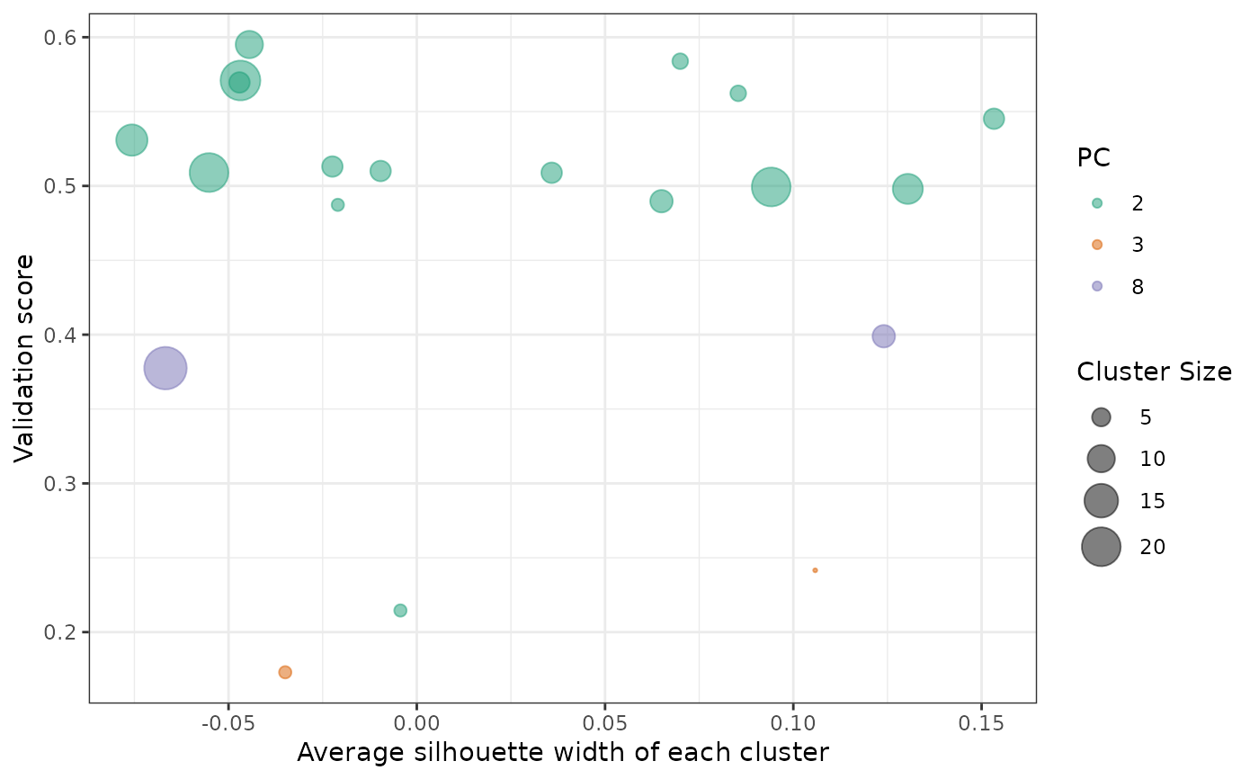
There are three main information on the graph:
x-axis : Pearson correlation coefficient. Higher value means that test dataset and RAV is more tightly associated with.
y-axis : Silhouette width representing the quality of RAVs.
size : The number of studies in each RAV. (= cluster size)
color : Test dataset's PC number that validate each RAV. Because we used top 8 PCs of the test dataset, there are 8 categories.
plotValidate(
  val_all,
  minClusterSize = 2,
  swFilter = FALSE,
  minSilhouetteWidth = 0,
  interactive = FALSE,
  minClSize = NULL,
  maxClSize = NULL,
  colorPalette = "Dark2"
)
Arguments
- val_all
Output from validate function.
- minClusterSize
The minimum size of clusters to be included in the plotting. Default value is 2, so any single-element clusters are excluded.
- swFilter
If
swFilter=TRUE, only RAV above the cutoff, defined throughminSilhouetteWidthargument will be plotted. Default isswFilter=FALSE- minSilhouetteWidth
A minimum average silhouette width to be plotted. Only effective under
swFilter=TRUEcondition. Default is 0.- interactive
If set to
TRUE, the output will be interactive plot. Default isFALSE.- minClSize
The minimum number of PCs in the clusters you want.
- maxClSize
The maximum number of PCs in the clusters you want.
- colorPalette
Default is
Dark2. For other color options, please checkscale_color_brewer
Value
a ggplot object