Session 1_1. What is Data Visualization
Questions
- What is data visualization?
- Why data visualization?
- What is dashboard?
Learning Objectives
- Know advantages and disadvantages of data visualization
- Understand the importance of data visualization
- Familiarize with the examples of data visualization
- Understand what main characteristics of dashboards
What is data visualization?
Data visualization is the graphical representation of information and data.
Advantage and disadvantages of data visualization
Advantages
- Can identify information that’s hard to see in table, such as trends and outliers
- Easily share information
- Interactively explore data
- Easy to understand patterns and relationships in data
Disadvantages
- Visualization with many different data points can lead an inaccurate assumption.
- Wrong design of visualization can be biased or confusing
- Display biased or inaccurate information
- Correlation doesn’t always mean causation
- Core message can get lost in translation
Major types of visualizations
There are a lot of visualization methods and below are three widely used options.
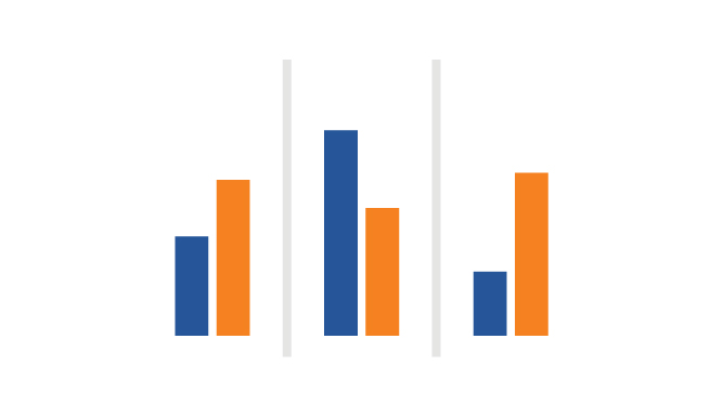
Charts display data in graphs, plots, and diagrams, organized along two axes. The horizontal line is the x-axis, and the y-axis is the vertical line.

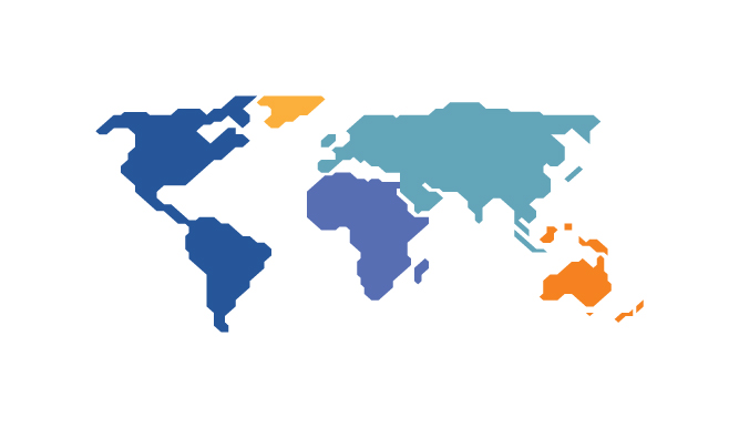
Geospatial visualizations display data in map form, using colors, shapes, and other visual elements to show the relationship between location and data.

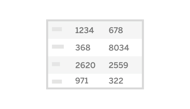
Tables display data in rows and columns as you’ve likely encountered in a spreadsheet. They represent exact numbers and categories.
What is Dashboard?
Dashboard is a collection of visualizations and data displayed in one place to help with analyzing and presenting data.
Even though infographic, a combination of visuals and words that represent data, is not a focus of this course, I put the table comparing those two to help you understand what dashboard is.
| Data Visuaslization | Infographics | |
|---|---|---|
| Complexity | Vary greatly in complexity, from simple bar charts to highly complex scientific visualizations | Generally quite simple, targeting a layman audience |
| Includes narrative or storytelling | No (this is external to the visualization) | Usually |
| Design and aesthetics | Often automatically generated - if published or used in presentations, more attention is paid to the design. | Often a lot of work goes into the design and making it aesthetically pleasing |
| Includes meta data (e.g. units, source, definitions) | Generally considered to be external to the data visualization (and often excluded) | Sometimes |
| Interactive | Increasingly so in web-based data visualizations | Rarely, infographics are normally static images |
Examples
Public Health Dashboards
- https://www.cdc.gov/nssp/using-dashboards-to-present-nssp-data.html
- https://dsripdashboards.health.ny.gov/
Public Health Infographics
- https://www.apha.org/news-and-media/multimedia/infographics
- https://www.cdc.gov/globalhealth/infographics/default.html
Summary
Data visualization is an efficient way to deliver information and there are many methods and tools available. You should understand advantages and disadvantages of data visualization to use it appropriately.
Reference
https://www.tableau.com/learn/articles/data-visualization#tools-software
https://www.tableau.com/data-insights/reference-library/visual-analytics