library(tidyverse)
library(dslabs)
gapminder |> as_tibble()
## # A tibble: 10,545 × 9
##    country   year infant_mortality life_expectancy fertility population      gdp
##    <fct>    <int>            <dbl>           <dbl>     <dbl>      <dbl>    <dbl>
##  1 Albania   1960            115.             62.9      6.19    1636054 NA
##  2 Algeria   1960            148.             47.5      7.65   11124892  1.38e10
##  3 Angola    1960            208              36.0      7.32    5270844 NA
##  4 Antigua…  1960             NA              63.0      4.43      54681 NA
##  5 Argenti…  1960             59.9            65.4      3.11   20619075  1.08e11
##  6 Armenia   1960             NA              66.9      4.55    1867396 NA
##  7 Aruba     1960             NA              65.7      4.82      54208 NA
##  8 Austral…  1960             20.3            70.9      3.45   10292328  9.67e10
##  9 Austria   1960             37.3            68.8      2.7     7065525  5.24e10
## 10 Azerbai…  1960             NA              61.3      5.57    3897889 NA
## # ℹ 10,535 more rows
## # ℹ 2 more variables: continent <fct>, region <fct>Data Visualization with ggplot2 #2
Questions
- How can I create multiple plots at once?
- How can I customize my plots?
Learning Objectives
- Describe what faceting is and apply faceting in ggplot.
- Modify the aesthetics of an existing ggplot plot.
- Build complex and customized plots from data in a data frame.
Setup
The Gapmidner Foundation is an organization dedicated to educating the public by using data to dispel common myths about the so-called developing world. Specifically, in this section, we use data to attempt to answer the following question: “Is it a fair characterization of today’s world to say it is divided into western rich nations and the developing world in Africa, Asia, and Latin America?”
We will be using the gapminder dataset provided in dslabs. This dataset was created using a number of spreadsheets available from the Gapminder Foundation. You can access the table like this:
Scatterplots
One of the common preconceived notions is that the world is divided into two groups: the western world (Western Europe and North America), characterized by long life spans and small families, versus the developing world (Africa, Asia, and Latin America) characterized by short life spans and large families. But do the data support this dichotomous view?
We will answer this question using the data from gapminder table. The first plot is a scatterplot of life expectancy versus fertility rates. We start by looking at data from about 50 years ago, when perhaps this view was first cemented in our minds.
The pipe operator can also be used to link data manipulation with consequent data visualization.
filter(gapminder, year == 1962) |>
    ggplot(aes(fertility, life_expectancy, color = continent)) +
    geom_point()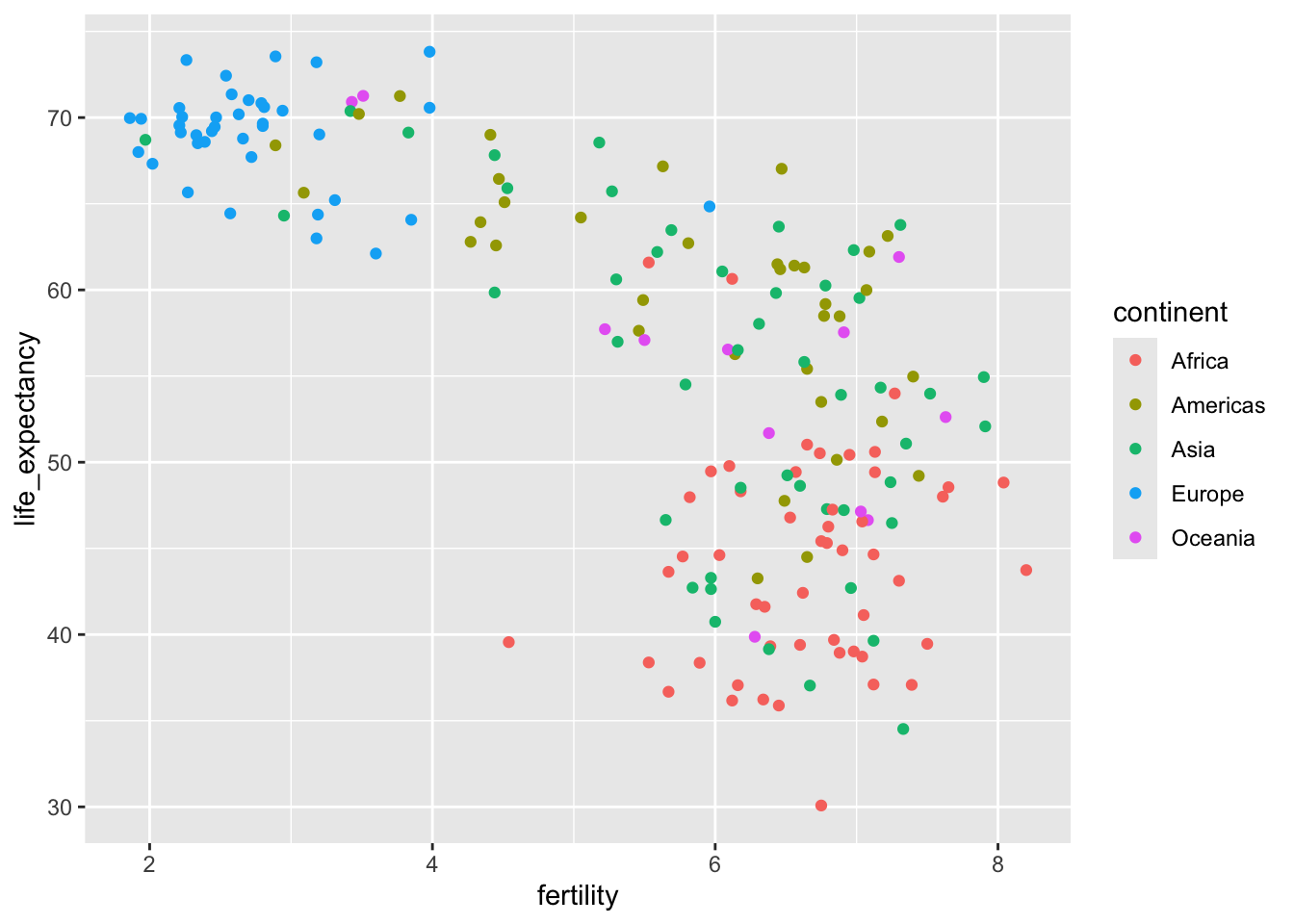
In 1962, “the West versus developing world” view was grounded in some reality. Is this still the case 50 years later?
Faceting
To compare the fertility and life expectance between 1962 and 2012, side by side plots are preferable. In ggplot2, we can achieve this by faceting variables: we stratify the data by some variable and make the same plot for each strata.
To facet, we add a layer with the function facet_grid, which automatically separate the plots. This function lets you facet by up to two variables using columns to represent one variable and rows to represent the other. The function expects the row and column variables to be separated by a ~. Here, becaues we want to split the plot only by year (i.e., use only one variable for faceting), use . for the other variable slot.
filter(gapminder, year %in% c(1962, 2012)) |>
    ggplot(aes(fertility, life_expectancy, col = continent)) +
    geom_point() +
    facet_grid(. ~ year)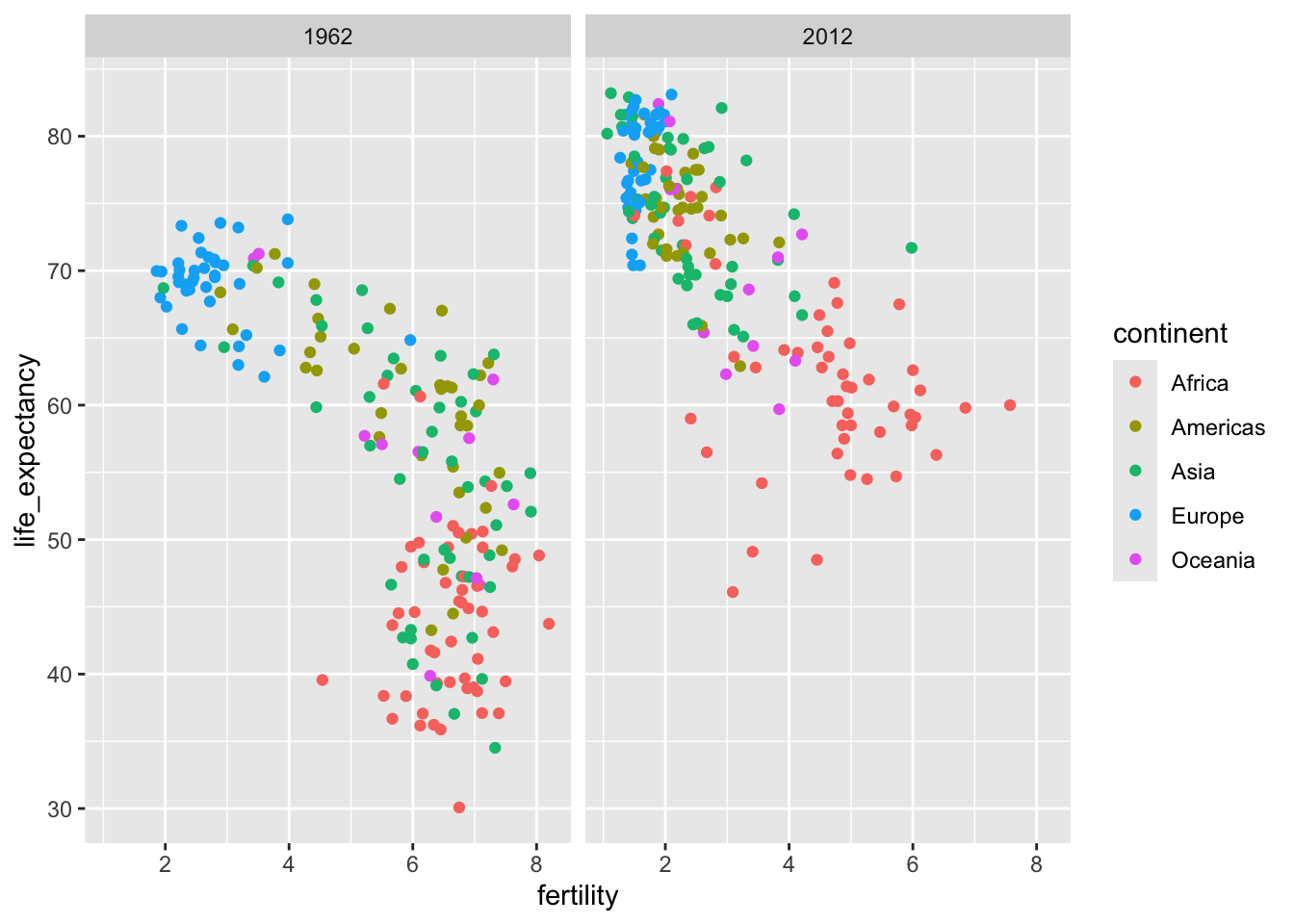
This plot clearly shows that the majority of countries have moved from the developing world cluster to the western world one. In 2012, the western versus developing world view no longer makes sense.
facet_wrap
To explore how this transformation happened through the years, we can make the plot for several years. For multiple plots, it would be better to use multiple rows and columns instead of a single row which is the default behavior of facet_grid. The function facet_wrap permits us to do this by automatically wrapping the series of plots so that each display has viewable dimensions:
years <- c(1962, 1972, 1982, 1992, 2002, 2012)
continents <- c("Europe", "Asia")
gapminder |>
    filter(year %in% years & continent %in% continents) |>
    ggplot(aes(fertility, life_expectancy, col = continent)) +
    geom_point() +
facet_wrap(~ year) 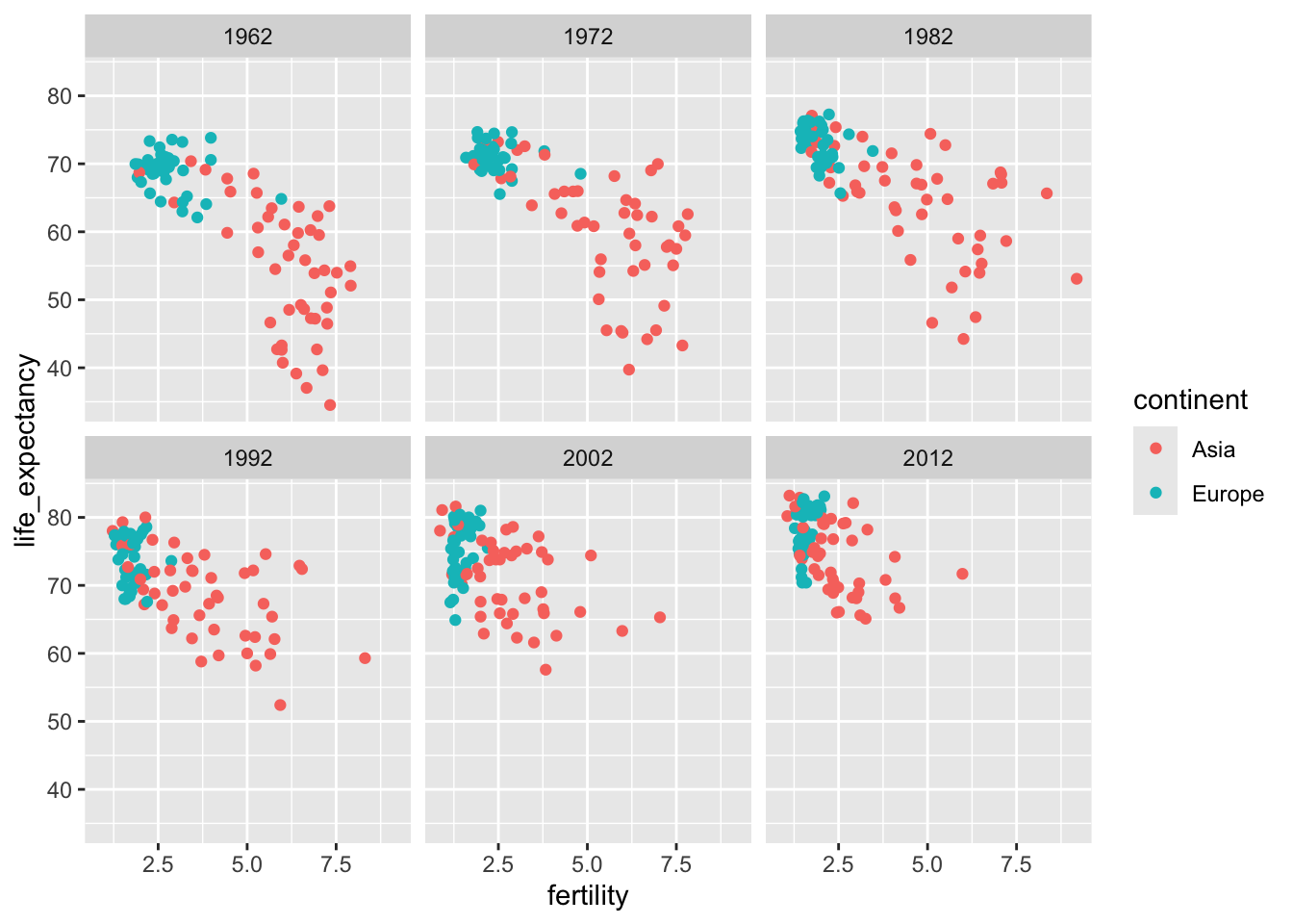
This plot clearly shows how most Asian countries have improved at a much faster rate than European ones.
Time series plots
The visualizations above effectively illustrate that data no longer supports the western versus developing world view. Once we see these plots, new questions emerge. For example, which countries are improving more and which ones less? Was the improvement constant during the last 50 years or was it more accelerated during certain periods? For a closer look that may help answer these questions, we introduce time series plots.
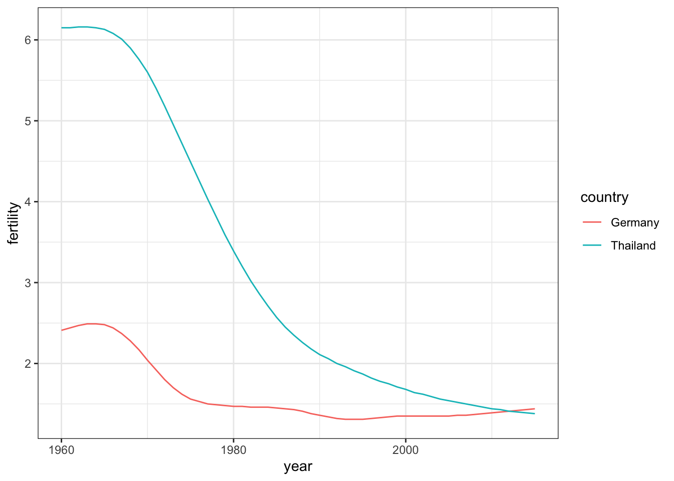
Time series plots have time in the x-axis and an outcome or measurement of interest on the y-axis. Using what we learned from the previous session, we can draw the time series plot comparing the changes in fertility rate of two countries, one from Europe and one from Asia.
countries <- c("Thailand", "Germany")
gapminder |> filter(country %in% countries & !is.na(fertility)) |>
    ggplot(aes(year, fertility, col = country)) +
    geom_line()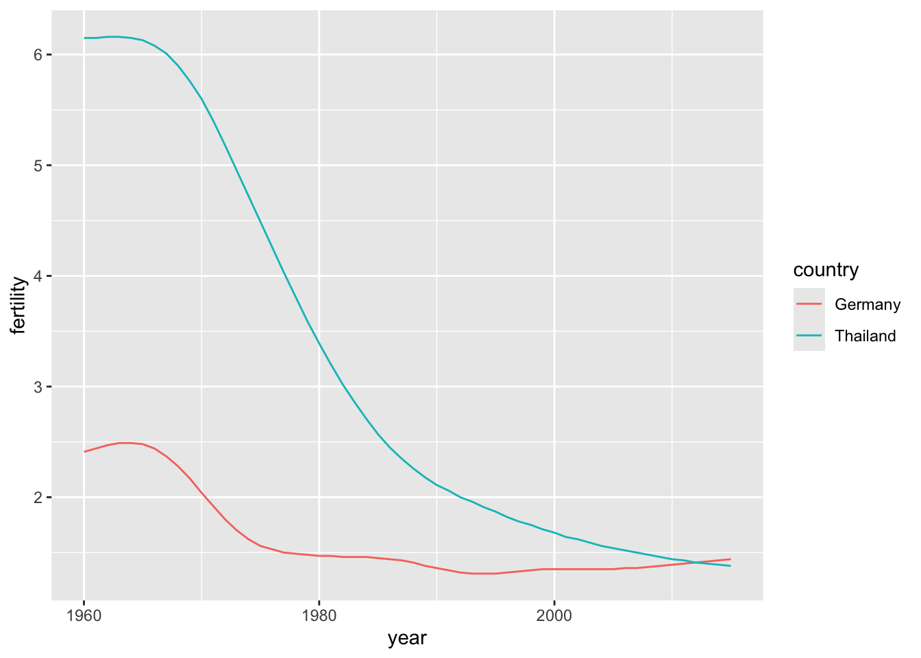
The plot clearly shows how Thailand’s fertility rate dropped drastically during the 1970s and 1980s, and by 2010 had a similar rate to that of Germany.
ggplot2 themes
Every single component of a ggplot graph can be customized using the generic theme() function. However, there are pre-loaded themes available that change the overall appearance of the graph without much effort.
For example, we can change our previous graph to have a simpler white background using the theme_bw() function:
Customization
Let’s save the above plot and add different layers to customize our plot.
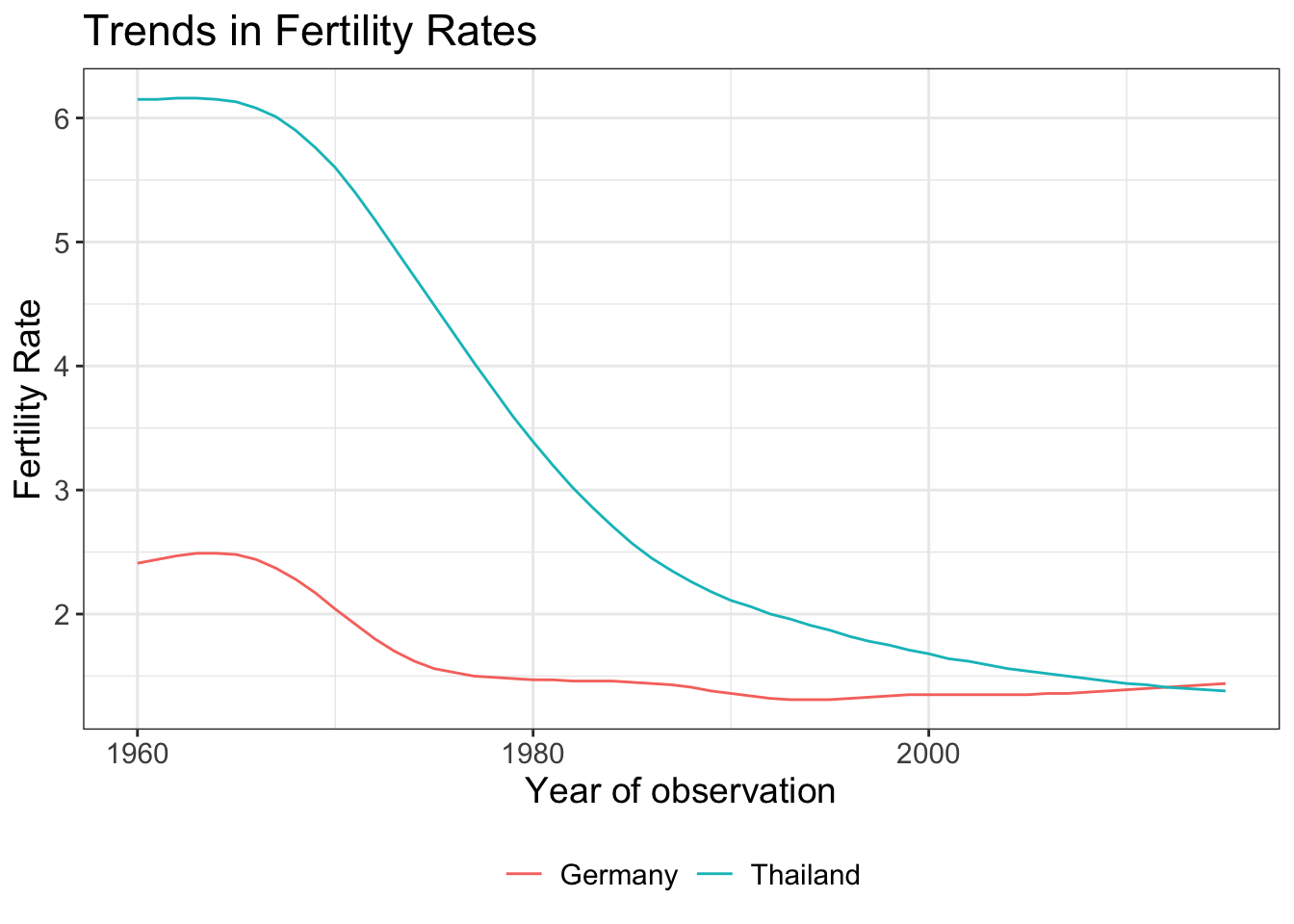
You can add title and update the axis labels.
plot +
    theme_bw() +
    labs(title = "Trends in Fertility Rates",
         x = "Year of observation",
         y = "Fertility Rate")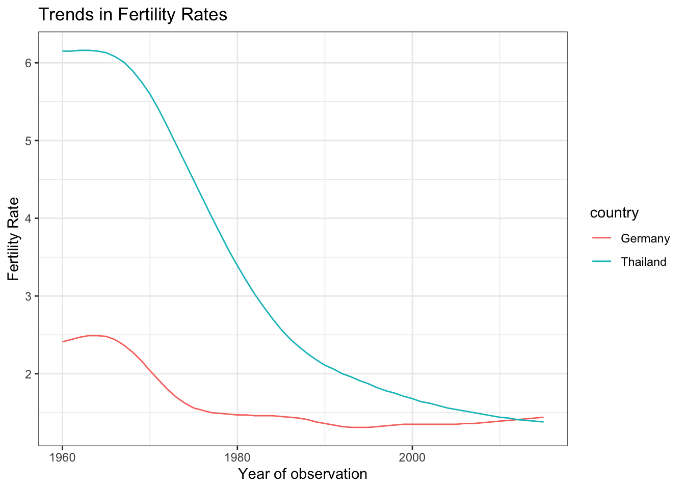
If you like your own theme, you can save it as an object and easily apply it to other plots.
my_theme <- theme_bw() +
    theme(legend.title = element_blank(),
          legend.position = "bottom",
          text = element_text(size = 14))

countries <- c("South Korea", "Germany")
gapminder |> filter(country %in% countries & !is.na(infant_mortality)) |>
    ggplot(aes(year, infant_mortality, col = country)) +
    geom_line() +
    my_theme
Exporting plots
my_plot <- gapminder |> filter(country %in% c("Thailand", "Germany") & !is.na(fertility)) |>
    ggplot(aes(year, fertility, col = country)) +
    geom_line() +
    theme_bw() +
    labs(title = "Trends in Fertility Rates",
         x = "Year of observation",
         y = "Fertility Rate") +
    theme(legend.title = element_blank(),
          legend.position = "bottom",
          text = element_text(size = 14))
You can use ggsave function to save your plot.
ggsave("data/name_of_file.png", my_plot, width = 5, height = 4)References
http://rafalab.dfci.harvard.edu/dsbook-part-1/dataviz/gapminder.html
