Data Visualization with ggplot2 #1
Questions
- What is the grammar of graphics established by ggplot2?
- How does ggplot2 generate graphics through layers?
Learning Objectives
- To understand ggplot2 aesthetic mapping of layers
- To generate graphics using ggplot2
Setup
Load the required package
We will use ggplot2, which is included in the tidyverse package.
Load the data
Load the survey data we downloaded and saved in Session 3_2.
surveys <- read_csv("data/portal_data_joined.csv")Remove NAs in data
Check how many NAs are there in each column.
      record_id           month             day            year         plot_id
              0               0               0               0               0
     species_id             sex hindfoot_length          weight           genus
              0            1748            3348            2503               0
        species            taxa       plot_type
              0               0               0
Remove the NAs and assign the updated table to a new object, named surveys_complete.
Plotting with ggplot2
The first step in learning ggplot2 is to be able to break a graph apart into components. The main three components to note are:
- Data: Default dataset to use for plot.
-
Geometry: Possible geometries include barplot, histogram, smooth densities, qqplot, and boxplot. (e.g.,
geom_bar,geom_histogram) - Aesthetic mapping describes how properties of the data connect with features of the graph, such as distance along an axis, size, or color. How we define the mapping depends on what geometry we are using.
ggplot object
ggplot2 refers to the name of the package itself and we use the function from this package called, ggplot(), to generate the plots.
# It renders a plot, but a blank slate since no geometry has been defined.
ggplot(data = surveys_complete)
Geometries
In ggplot2 we create graphs by adding layers. Layers can define geometries, compute summary statistics, define what scales to use, or even change styles. To add layers, we use the symbol +. In general, a line of code will look like this:
DATA |>
ggplot()+ LAYER 1 + LAYER 2 + … + LAYER N
Usually, the first added layer defines the geometry.
Aesthetic mappings
The aes() function connects data with what we see on the graph by defining aesthetic mappings.
Now, you can create a scatterplot of ‘hindfoot_length’ versus ‘weight’ in the survey data. Like dplyr functions, aes also uses the variable names from the object component without having to call them. (e.g., weight instead of surveys_complete$weight)
ggplot(data = surveys_complete,
       aes(x = weight, y = hindfoot_length)) +
  geom_point()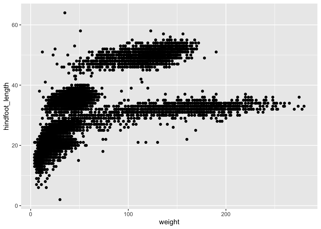
Instead of defining out plot from scratch, we can also add a layer to the ggplot object.
# Assign plot to a variable
# `surveys_plot` is a ggplot object
surveys_plot <- ggplot(data = surveys_complete,
                       mapping = aes(x = weight, y = hindfoot_length))

# Draw the plot
surveys_plot +
    geom_point()
- Anything you put in the
ggplot()function can be seen by any geom layers that you add (i.e., these are universal plot settings). This includes the x- and y-axis you set up inaes(). - You can also specify aesthetics for a given geom independently of the aesthetics defined globally in the
ggplot()function. - The previous version of the
ggplot2package, calledggplot, which also contained theggplot()function is now unsupported and has been removed from CRAN in order to reduce accidental installations and further confusion.
The + sign used to add layers must be placed at the end of each line containing a layer. If, instead, the + sign is added in the line before the other layer, ggplot2 will not add the new layer and will return an error message.
# This is the correct syntax for adding layers
surveys_plot +
  geom_point()

# This will not add the new layer and will return an error message
surveys_plot
  + geom_point()
Building up your plots
Building plot with ggplot2 is typically an iterative process.
For example, we can add transparency (alpha) to avoid overplotting:
ggplot(data = surveys_complete,
       aes(x = weight, y = hindfoot_length)) +
    geom_point(alpha = 0.1)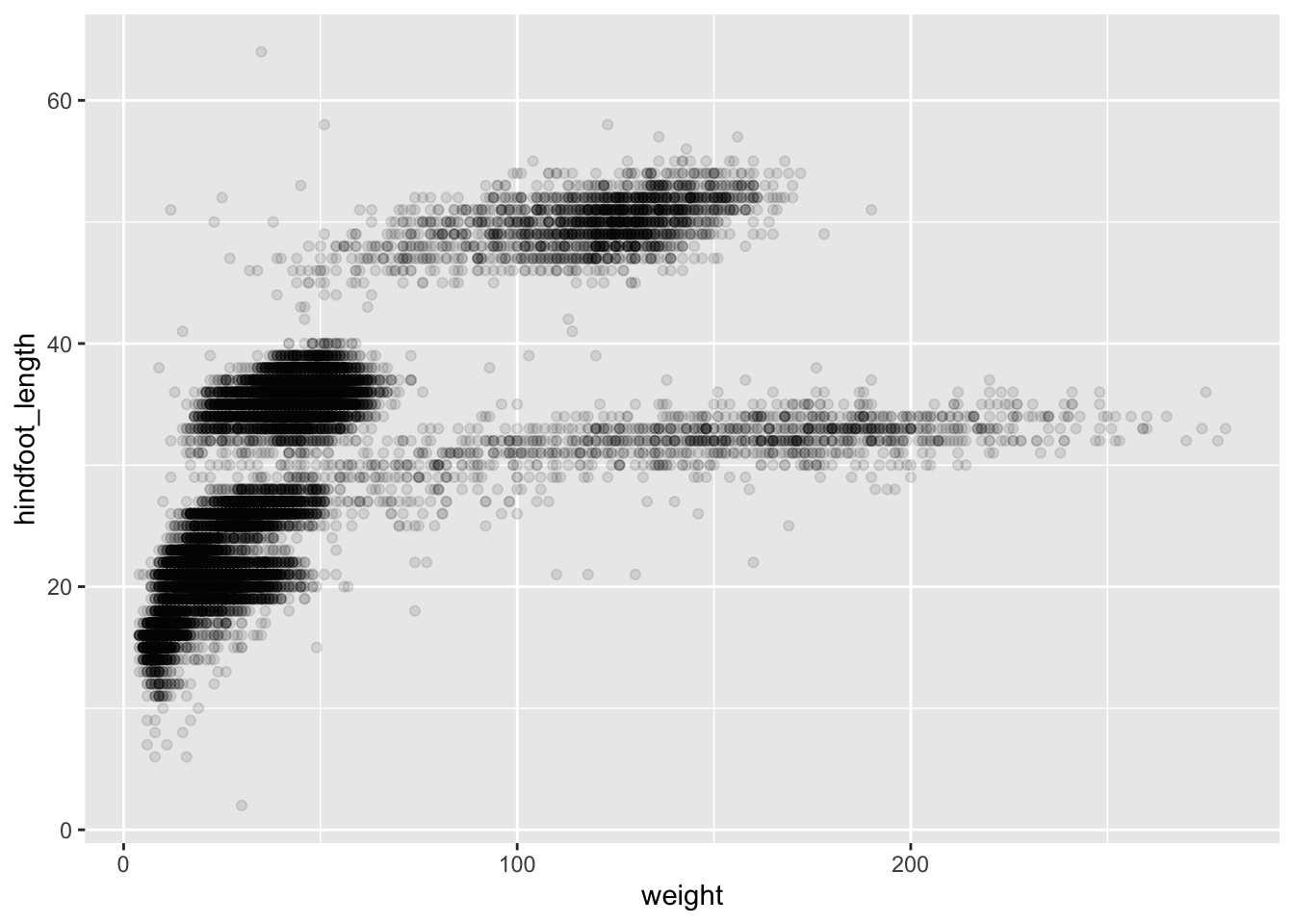
We can also add colors for all the points:
ggplot(data = surveys_complete,
       aes(x = weight, y = hindfoot_length)) +
    geom_point(alpha = 0.1,
               color = "blue")
In this example color is not a mapping: whereas mappings use data from specific observations and need to be inside aes(), the above operation where we want to affect all the point the same way does not need to be included inside aes().
Or use colors for aesthetic mapping by using a vector as an input to the argument color within aes() function. Let’s color each species in the plot differently:
ggplot(data = surveys_complete,
       mapping = aes(x = weight, y = hindfoot_length)) +
    geom_point(alpha = 0.1,
               aes(color = species_id))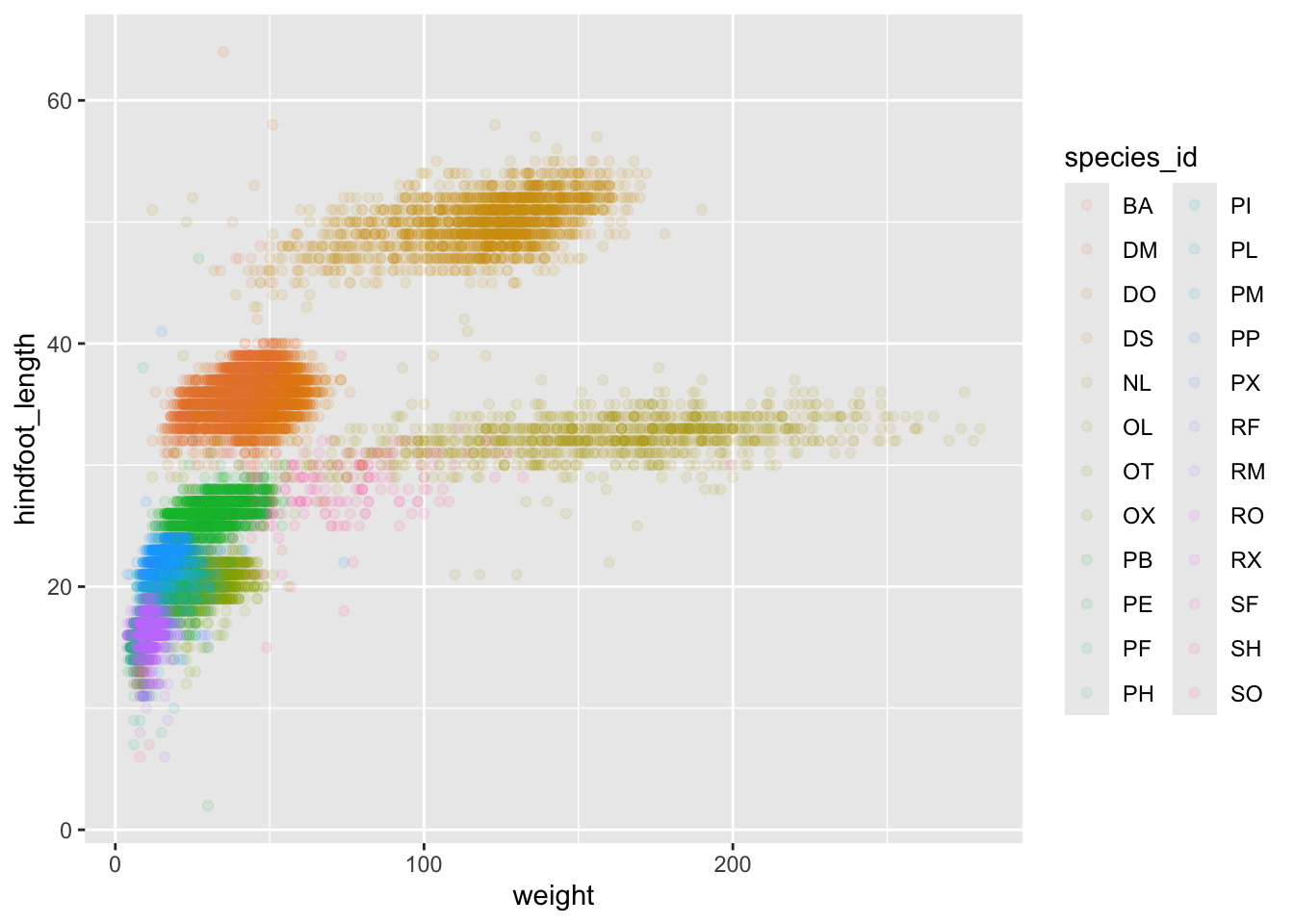
Global versus local aesthetic mappings
In the previous lines of code, geom_point knows what x and y variables it is working on even though they are not defined in its own aes(). It is because those are defined using a global aesthetic mapping when we create ggplot object.
If necessary, we can override the global mapping by defining a new mapping within each layer. These local definitions override the global. Here is an example:
ggplot(data = surveys_complete,
       aes(x = weight, y = hindfoot_length, color = species_id)) +
    geom_point(alpha = 0.1, color = "blue")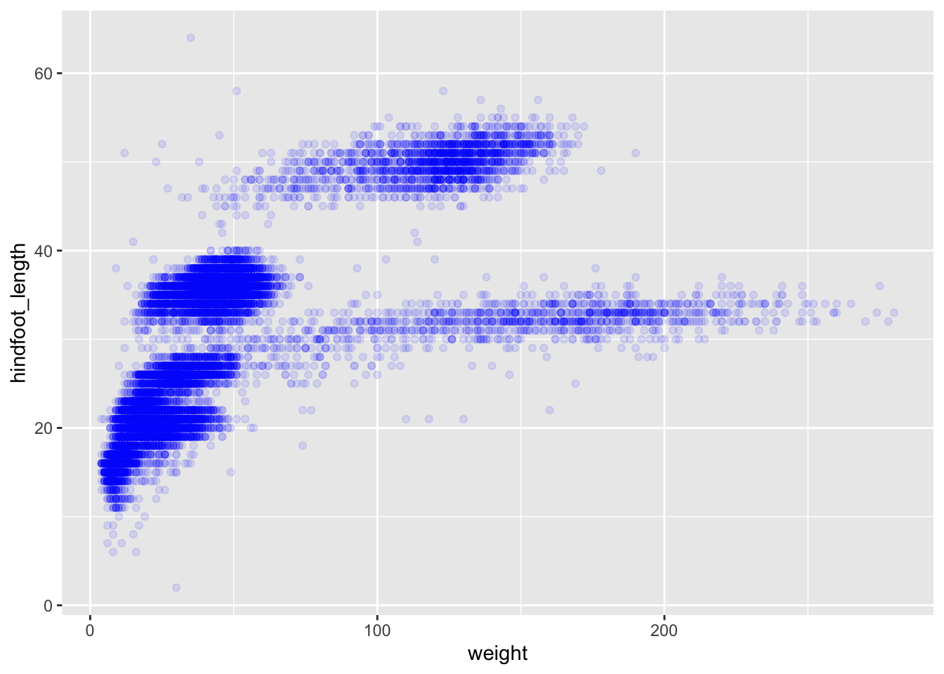
Boxplot
We can use boxplots to visualize the distribution of weight within each species:
ggplot(data = surveys_complete,
       mapping = aes(x = species_id, y = weight)) +
    geom_boxplot()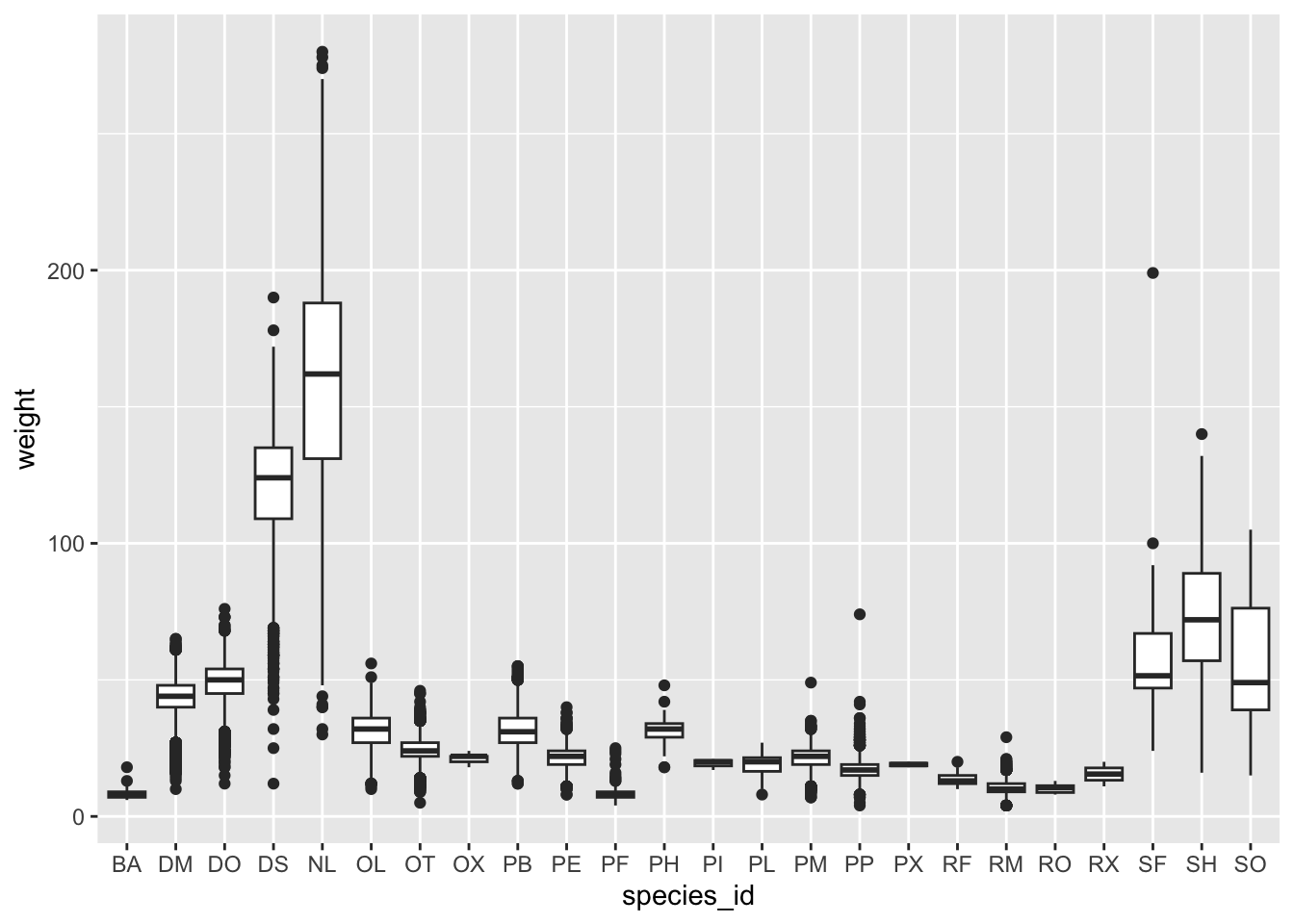
By adding points to the boxplot (using geom_jitter), we can have a better idea of the number of measurements and of their distribution. Because the boxplot will show the outliers by default these points will be plotted twice – by geom_boxplot and geom_jitter. To avoid this we must specify that no outliers should be added to the boxplot by specifying outlier.shape = NA.
ggplot(data = surveys_complete,
       mapping = aes(x = species_id, y = weight)) +
    geom_boxplot(outlier.shape = NA) +   # don't plot outlier in boxplot
    geom_jitter(alpha = 0.3,
                color = "tomato")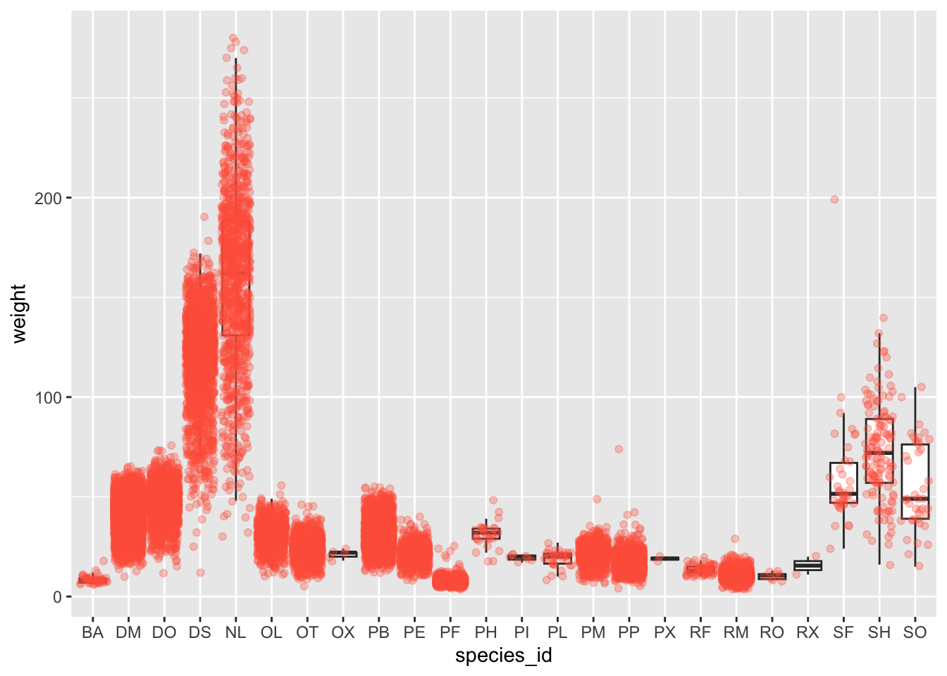
Plotting time series data
Calculate the number of counts per year for each genus:
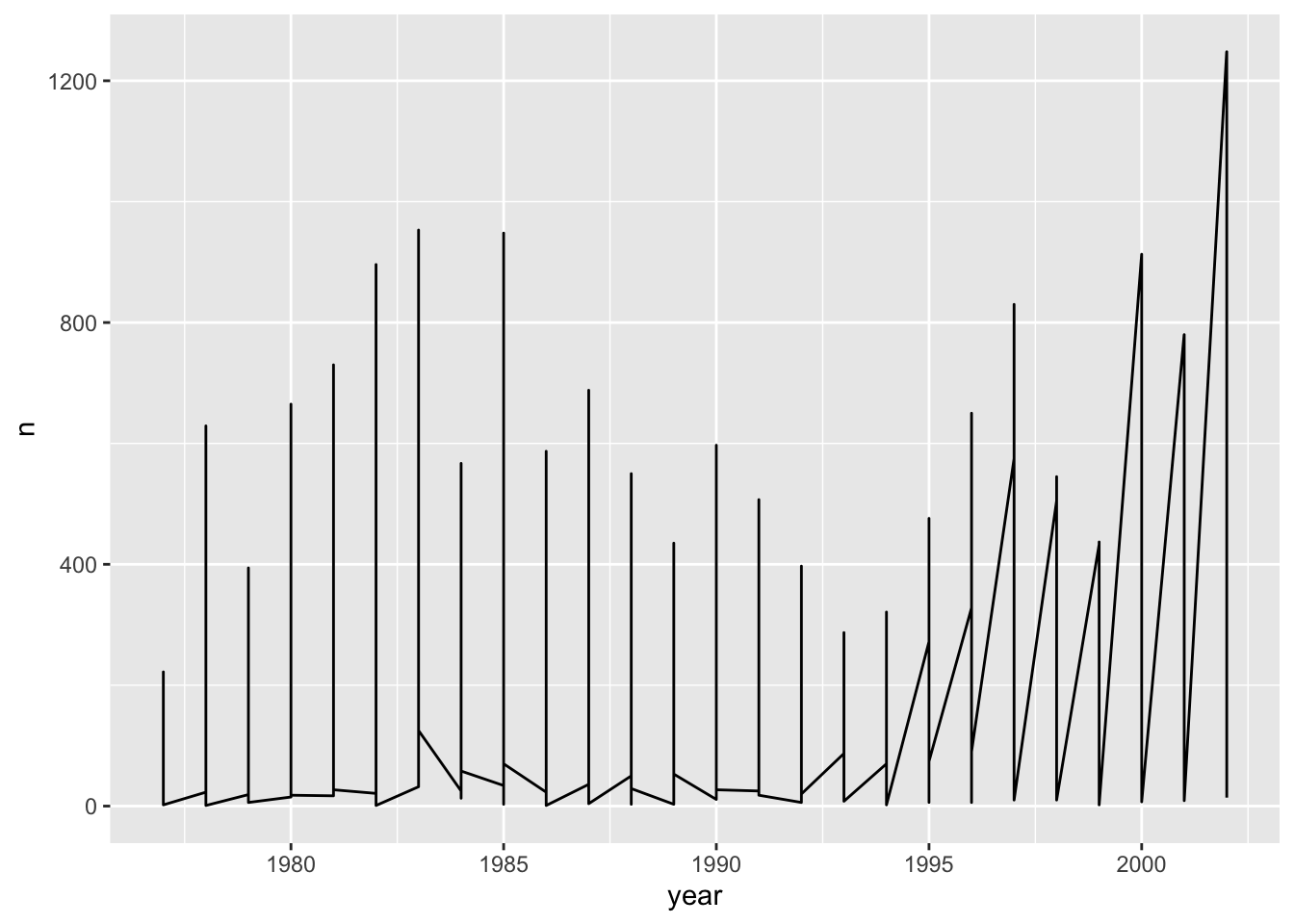
Data contains all the genera together. When the points are regularly and densely spaced, as they are here, we create curves by joining the points with lines, to convey that these data are from a single series, here a country. To do this, we use the geom_line function instead of geom_point. so if we plot this directly:
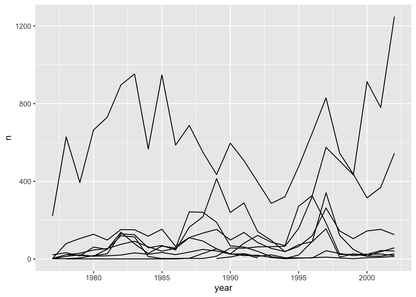
Unfortunately, this is not the plot that we want. Rather than a line for each genus, the points for all genera are joined. This is actually expected since we have not told ggplot anything about wanting multiple separate lines. To let ggplot know that there are multiple curves that need to be made separately, we modify the aesthetic function with an additional argument, group = genus.
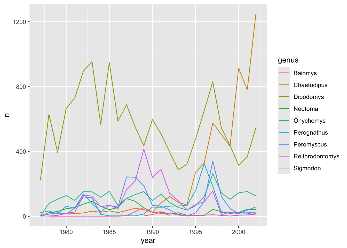
We can assign colors to make more clear distinction. Conveniently, color argument automatically groups the data.
ggplot2 breaks plots into components in a way that permits beginners to create relatively complex and aesthetically pleasing plots using syntax that is intuitive and comparatively easy to remember. You still need to learn several functions and arguments, though. These are hard to memorize, so it is highly recommended you to have the ggplot2 cheat sheet handy. You can get a copy HERE.
References
https://datacarpentry.org/R-ecology-lesson/instructor/04-visualization-ggplot2.html
http://rafalab.dfci.harvard.edu/dsbook-part-1/dataviz/ggplot2.html
