Session 2_1. Key types of charts
Questions
- What kinds of charts are available?
- What types of charts should I use for my data visualization?
Learning Objectives
- Know key types of charts
- Understand the strength and weakness of different chart types
What is a Chart?
A chart is a representation of data in the form of a graph, diagram, map, or tabular format. Consider the most common Charts: Scatterplots, Bar Charts, Line Graphs, and Pie Charts. These chart types, or a combination of them, provide answers to most questions with relational data.
People often use “charts” and “graphs” to describe the largest family of visualizations. They may choose the term based on an academic convention. Or because they believe the distinction between them is important. Sometimes the terms complement one another. Sometimes they are synonymous. And sometimes people use them to make minor distinctions between types of visualizations.
Charts display many forms of analysis in a visual format: comparison, relationship, distribution, and composition. No two charts tell the same story. Consider the kind of data you want to present and the implications you want your audience to draw from that data before you decide what to use.
Key types of charts
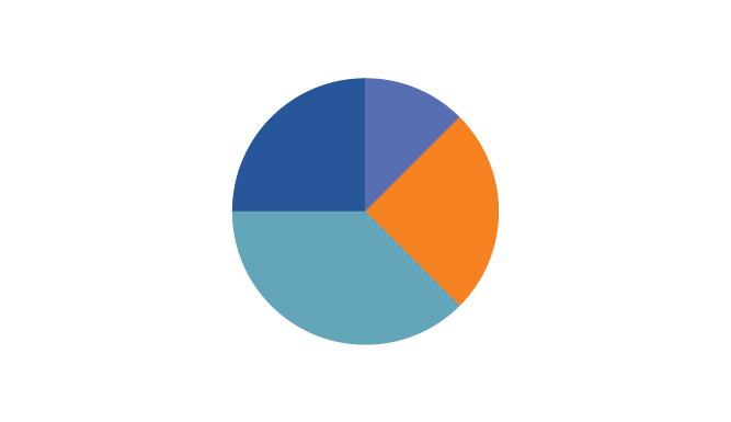
Pie Chart
A common, but limited, visualization used to show how a few dimensions compare to one another and the whole. Usually, the chart splits the numerical data (measure) into percentages of the total sum. Each slice represents the proportion of the value, and should be measured accordingly.
When to use pie charts?
They work best with dimensions that have a limited number of categories. If you need to emphasize that one section of the whole is over-represented or underrepresented, a pie chart can make that story within the data stand out. Pie charts do not work well for comparing exact numbers!
- Use a pie chart if:
- You have a total number that can be split up into 2-5 categories
- One category outweighs the other by a significant margin
- Do not use a pie chart if:
- Your dimension has too many categories
- Similar percentages/numbers exist between different values within the chosen dimension
- Data doesn’t represent a uniform “whole”, or the percentages don’t measure to 100 percent
- There are negative values or complex fractions in your measure value
How to use pie charts?
- Each pie slice should be labeled appropriately, with the right number or percentage attached to the corresponding slice.
- The slices should be ordered by size, either from biggest to smallest or smallest to biggest to make the comparison of slices easy for the user.
- Limit the use of legends and external references as they make it harder to recall the dimensions.
- Labels should be attached to the slices themselves whenever possible.
- NEVER complicate the visual display. A 3-dimensional pie chart is much harder to analyze. Complicating the chart with unnecessary graphics or logos can make it overwhelming.
Three-dimensional pie charts are difficult to read and misleading. Since the interpretation of a pie chart relies on the area, arc length, and angle of each slice, a three-dimensional representation of this chart type will tilt the pie and skew your visual perception of its slices. The use of a three-dimensional pie chart can make an accurate comparison of categories nearly impossible due to the visual imbalance that can exist between slices.
Bar Chart
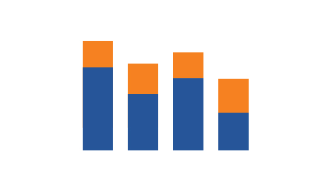
Bar charts enable us to compare numerical values like integers and percentages. They use the length of each bar to represent the value of each variable. For example, bar charts show variations in categories or subcategories scaling width or height across simple, spaced bars, or rectangles.
How to read bar charts?
Bar charts can represent quantitative measures vertically, on the y-axis, or horizontally, on the x-axis. The qualitative dimension will go along the opposite axis of the quantitative measure. Bar charts typically have a baseline of zero. If another starting point is used, the axis should be clearly labeled to avoid misleading the Viewer.
When to use bar chart?
- Compare different values in subcategories
- A stacked bar chart can show extra detail within the overall measure
- Show measures over a specific (discrete) length of time, while other chart types can show a ‘continuous’ amount of time.
Bar charts: To-dos and Not-dos
- Do these:
- The base starts at zero
- The axes are labeled clearly
- Colors are consistent and defined (in legend)
- Not displaying too many bars
- Don’t do these:
- Make each bar a different width
- Cram too many bars into subcategories
- Leave the axes unlabeled
Line Chart
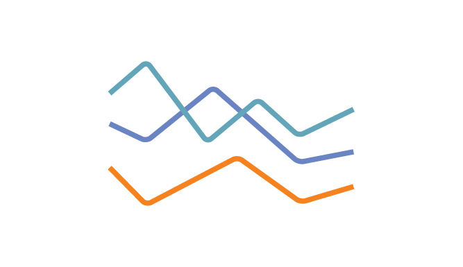
A line chart, also referred to as a line graph or a line plot, connects a series of data points using a line. This chart type presents sequential values to help you identify trends. Most of the time, the x-axis (horizontal axis) represents a sequential progression of values. The y-axis (vertical axis) then tells you the values for a selected metric across that progression. This is a common chart and is great to use when you want to show data over time.
How to read line chart?
For most line charts, the horizontal axis represents a dimension of time, while the vertical axis represents a quantitative value. Line charts can display both single or many lines on a chart. The use of a single line or many lines depends on the type of analysis the chart should support.
A line chart with many lines allows for comparisons between categories within the chosen field. When a field has several members, different colors are often used to make it possible to distinguish between members on the chart. It is also important to remember that charts with fewer lines are easier to read.
When to use line chart?
A line chart supports monitoring behavior in a set of data. These charts are useful for more than tracking change over time. They also help highlight differences and correlations within your data. Furthermore, a line chart can help a viewer make predictions about what might happen next.
- Line chart is useful to answer questions like the following:
- What pattern appear in the data over time?
- Is the data in an upward trend or a downward trend?
- Is one category performing better than other sets of data?
How to use line chart?
- The horizontal line should focus on a measurement with regularly occurring intervals. Usually, the horizontal line defines a length of time, but it can also focus on another form of measurement as well, so long as it meets the requirements (e.g. iterations of an experiment).
- Use color to identify deviations from the average or a target goal or to define individual members within a measured category.
- line charts do not require a zero baseline
- The goal of an effective line chart is to emphasize changes and direction in your data, not display the size of the values themselves.
Scatterplot
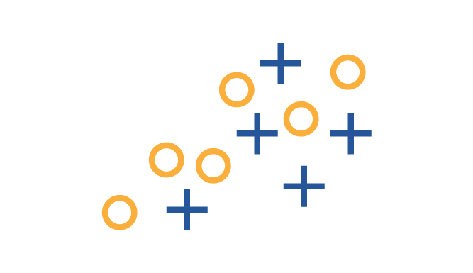
A scatter plot displays data points on a chart at the point at which two measures intersect. Scatter plots make it easy to analyze the relationship between two numbers, as they display all data points in the same view. The x-axis (horizontal line) and y-axis (vertical line) each contain their own field. Scatter plots display data points as dots or symbols along the x- and y-axes of a chart.
How to read scatter plots?
- In general, the x-axis is the chart’s independent variable, and the y-axis is the chart’s dependent variable. A scatter plot’s purpose is to show how changes in the independent variable change the dependent variable.
- Understand what the independent (x-axis) and dependent variables (y-axis) are measuring.
- If the variables correlate they will fall along a line or curve. The stronger the correlation the tighter the data points will follow the line or curve.
- Scatter plots help identify correlations between variables. But it’s important to remember that correlation does not equal causation.
When to use scatter plots?
You can use scatter plots to investigate whether there is a relationship between two variables. Doing so can show if one variable is a good predictor of another.
Histogram
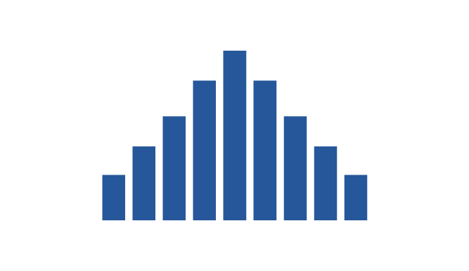
Histograms are a specific variation of bar charts, and provide a way to show distributions of data. A histogram tracks the different values found in one set of data as a series of connected bars. Statisticians, scientists, and analysts refer to the widths of each bar as bins or classes.
How to read histogram?
Histograms split a single continuous measure into bins, or groups, that represent a specific range of values. Data points are then grouped into these equally sized bins. The bins are then displayed visually as bars stacked next to each other (there should be no spaces between bars!).
When to use histogram?
- Histograms work best when displaying continuous, numerical data.
- Unlike bar charts, histograms do not support comparisons between two or more categories.
- Histogram can help you to understand the distribution of values within a single category
How to use histogram?
To plot a histogram you need a continuous value and an axis starting at zero to properly display the count of values within each bin. While these counts can be zero, there won’t be negative values.
Boxplot
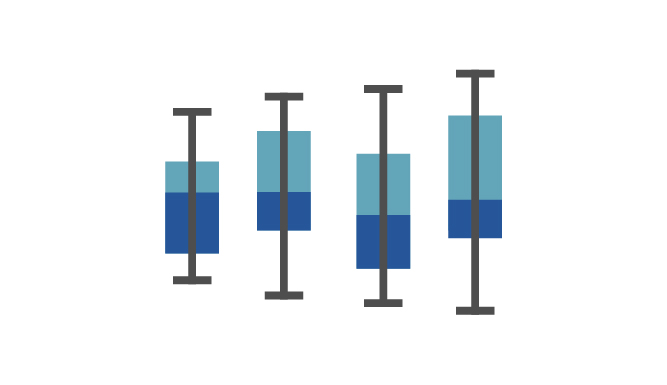
Boxplots (sometime known as box and whisker plots) show the distribution of data points across a selected measure. These charts display ranges within variables measured. This includes the outliers, the median, the mode, and where the majority of the data points lie in the “box”. These visuals are helpful to compare the distribution of many variables against each other.
How to read box plots?
Box plots portray the distribution of your data, outliers, and the median. The box within the chart displays where around 50 percent of the data points fall.
-
It summarizes a data set in five marks:
- Likely fall outside the box:
- the maximum (the mark with the greatest value)
- the minimum (the mark with the lowest value)
- the maximum (the mark with the greatest value)
- … and the box itself contains:
- the lower quartile (25th percentile)
- the upper quartile (75th percentile)
- the median (middle, the value separating the higher half from the lower half of a data)
- the lower quartile (25th percentile)
- Likely fall outside the box:
You can think of the median as “the middle” value in a set of numbers based on a count of your values rather than the middle based on numeric value.
The whiskers (the lines extending from the box on both sides) typically extend to 1.5* the Interquartile Range (the box) to set a boundary beyond which would be considered outliers.
When to use box plots?
- To show the distribution of data within a population
- To compare distributions between members of a category in your data
- To determine the existence of outliers within the dataset
How to use box plots?
You need a qualitative categorical field to partition your view by (i.e. each bars). You also need a more granular quantitative value to partition your categorical field by (i.e. data points within each bars).
Summary
- Avoid too much content (e.g. categories, colors, etc.) in your visualization because it makes your visualization confusing and difficult to read.
- We reviewed several plotting options focusing on what they are, how to read them, and when/how to use them.
Reference
https://www.tableau.com/data-insights/reference-library/visual-analytics/charts