Session 5_1. Data Visualization Principles
1. Encoding data using visual cues
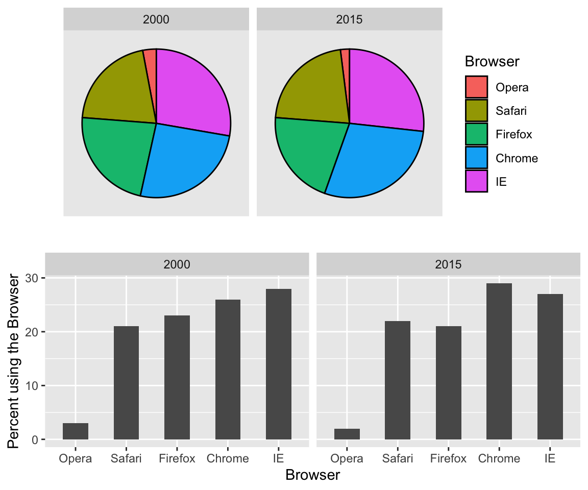
Data encoding can be done through several methods, such as position, aligned lengths, angles, brightness, and color hue.
The preferred way to plot these quantities is to use length and position as visual cues, since humans are much better at judging linear measures, such as barplots.
Notice how much easier it is to see the differences in the barplot.
If for some reason you need to make a pie chart, label each pie slice with its respective percentage so viewers do not have to infer them from the angles or area:
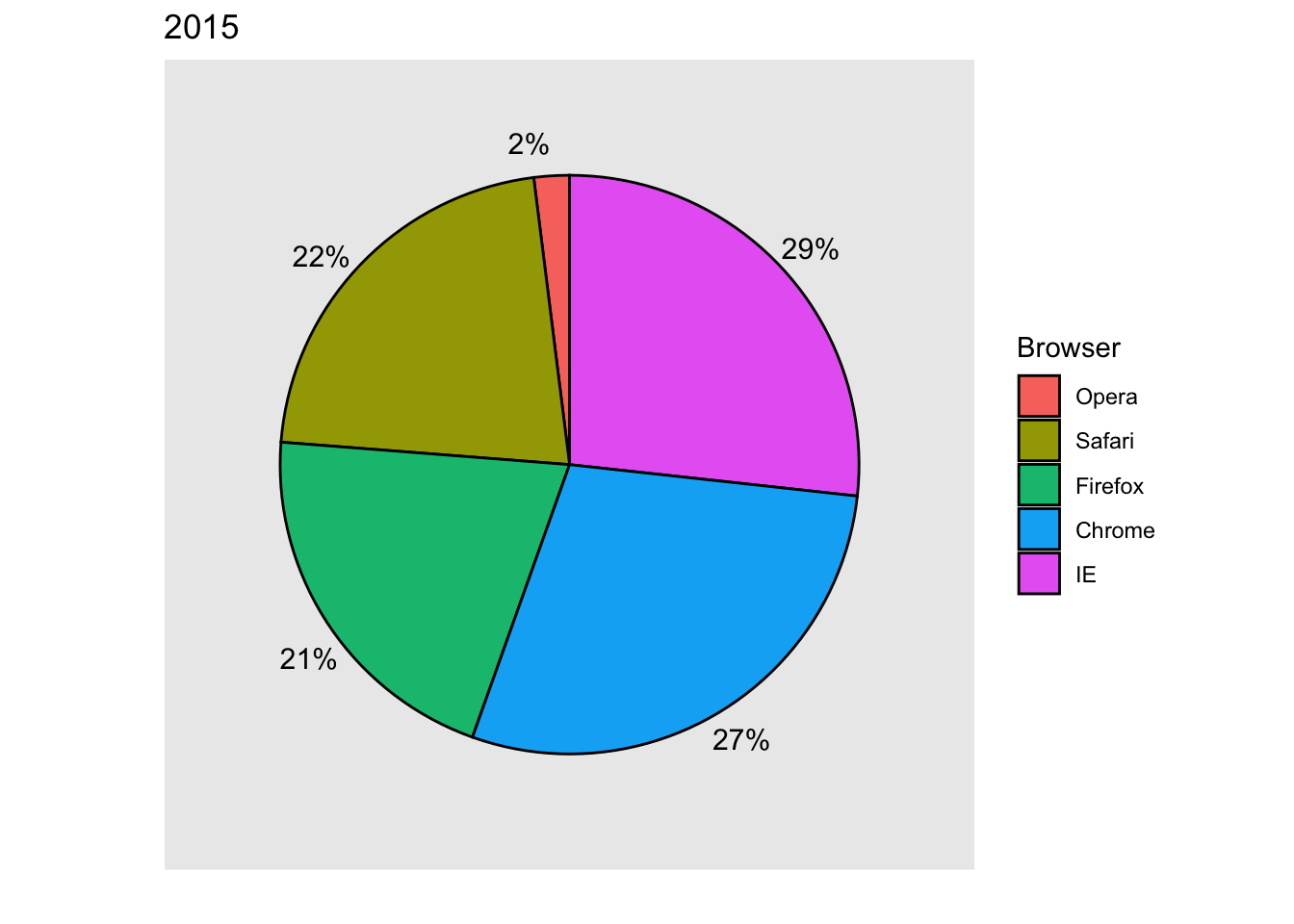
In general, when displaying quantities, position and length are preferred over angles and/or area. Brightness and color are even harder to quantify than angles. But, as we will see later, they are sometimes useful when more than two dimensions must be displayed at once.
2. Know when to include 0
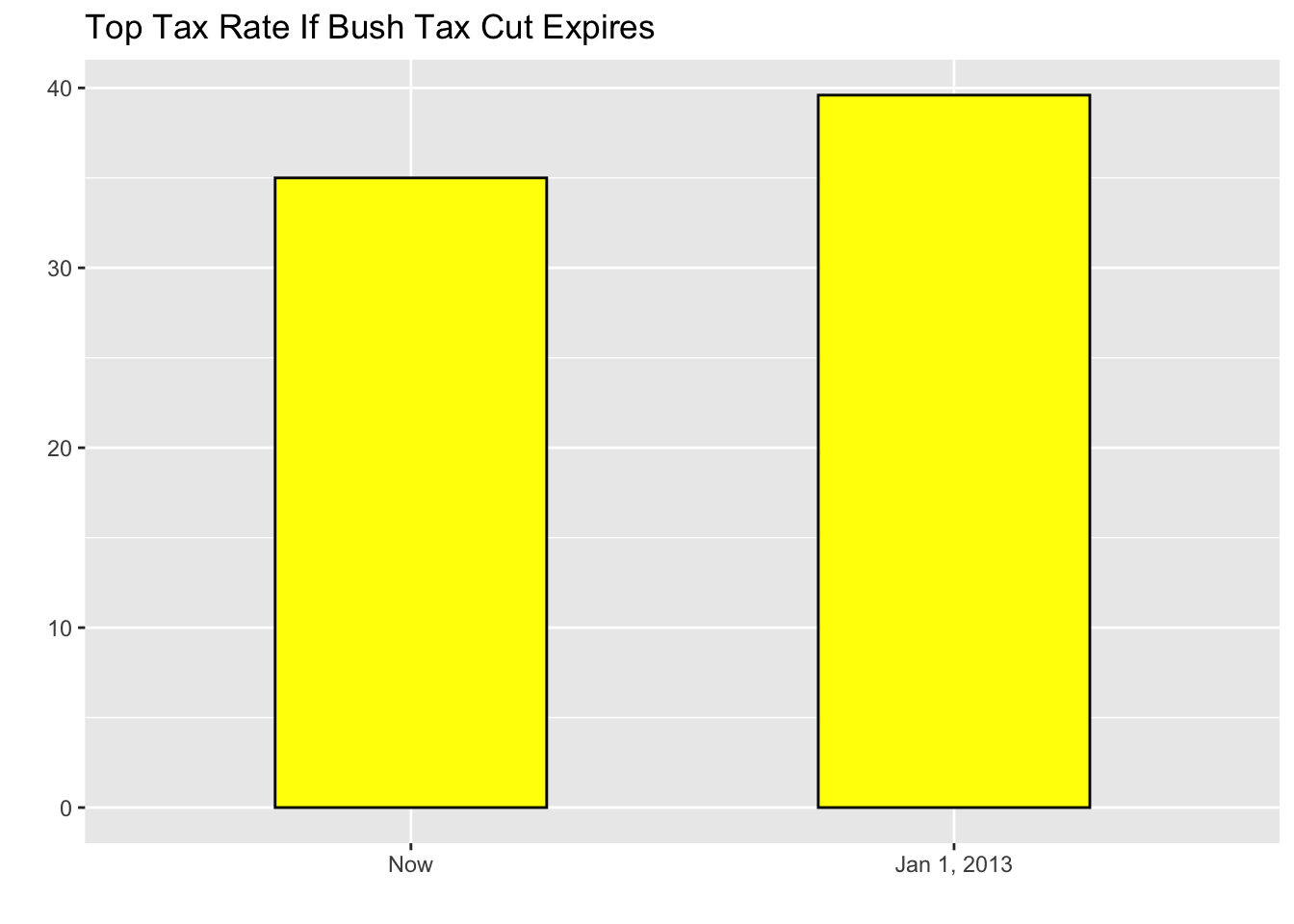
When using barplots, it is misinformative not to start the bars at 0. This is because, by using a barplot, we are implying the length is proportional to the quantities being displayed. By avoiding 0, relatively small differences can be made to look much bigger than they actually are. This approach is often used by politicians or media organizations trying to exaggerate a difference.

(Source: Fox News, via Flowing Data1.)
This plot makes a 4.6% increase look like a five fold change. Here is the appropriate plot:
When using position rather than length, it is then not necessary to include 0. This is particularly the case when we want to compare differences between groups relative to the within-group variability. Here is an illustrative example showing average life expectancy stratified across continents in 2012:
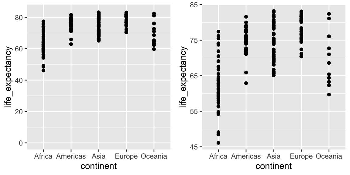
Note that in the plot on the left, which includes 0, the space between 0 and 43 adds no information and makes it harder to compare the between and within group variability.
3. Do not distort quantities
During President Barack Obama’s 2011 State of the Union Address, the following chart was used to compare the US GDP to the GDP of four competing nations:

(Source: The 2011 State of the Union Address2)
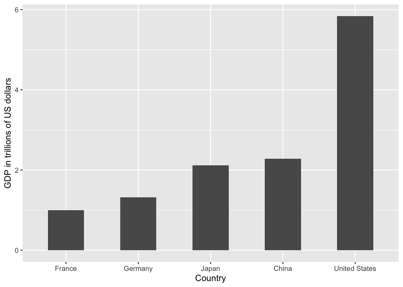
Judging by the area of the circles, the US appears to have an economy over five times larger than China’s and over 30 times larger than France’s. However, if we look at the actual numbers, we see that this is not the case. The actual ratios are 2.6 and 5.8 times bigger than China and France, respectively. The reason for this distortion is that the radius, rather than the area, was made to be proportional to the quantity, which implies that the proportion between the areas is squared: 2.6 turns into 6.5 and 5.8 turns into 34.1. Here is a comparison of the circles we get if we make the value proportional to the radius and to the area:
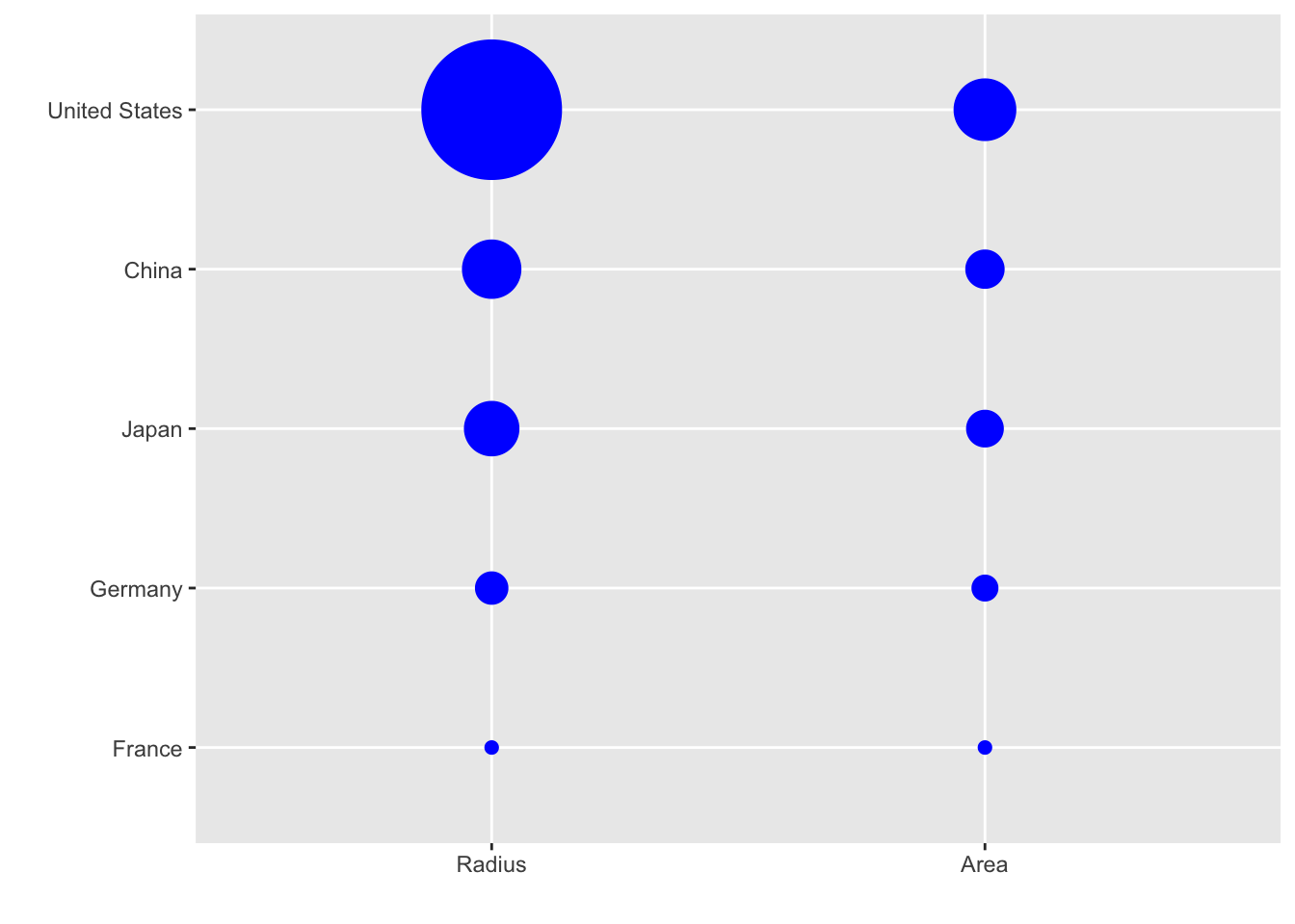
Of course, in this case, we really should not be using area at all since we can use position and length:
4. Order categories by a meaningful value
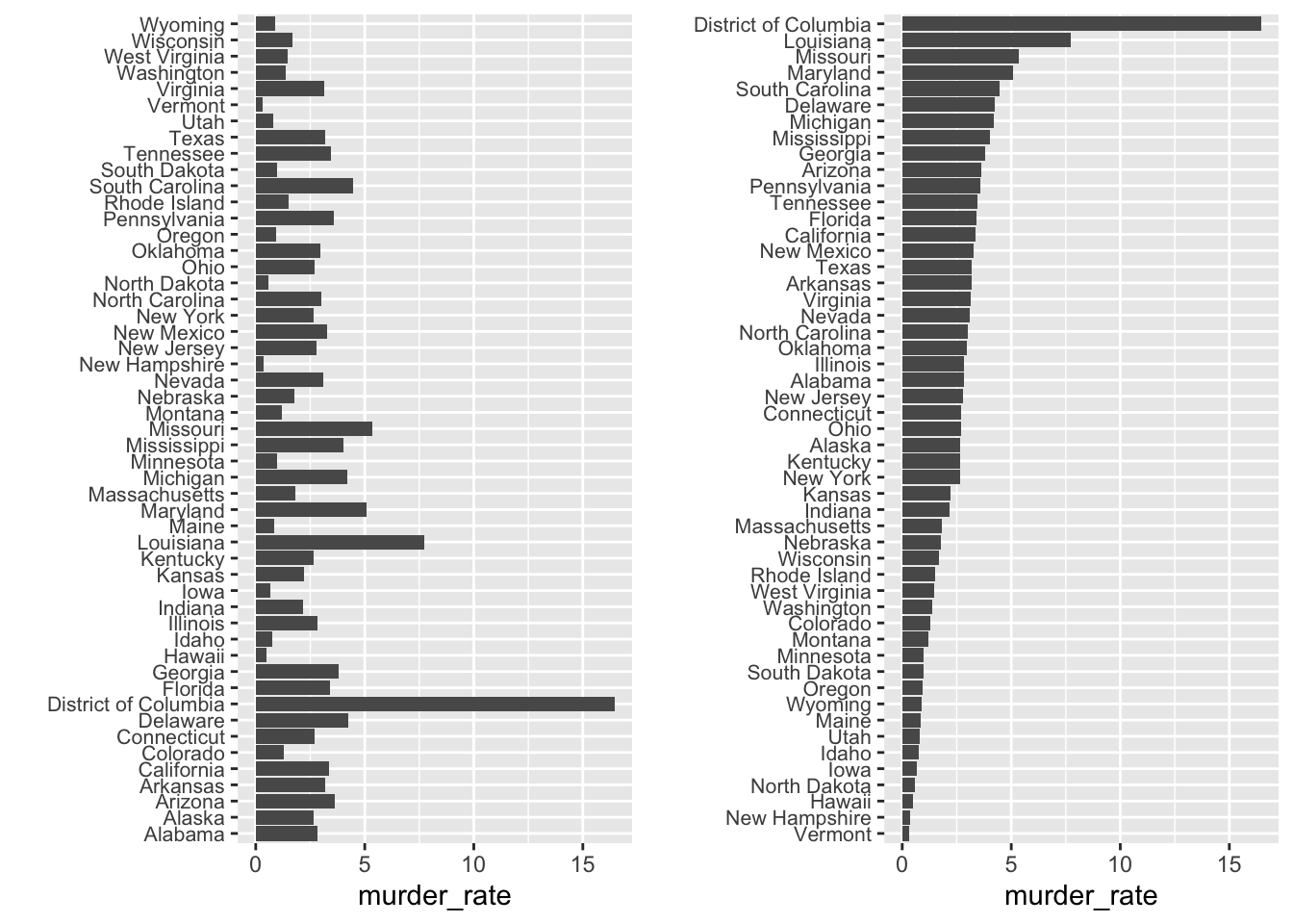
When one of the axes is used to show categories, as is done in barplots, the default ggplot2 behavior is to order the categories alphabetically when they are defined by character strings. If they are defined by factors, they are ordered by the factor levels. However, alphabetical order is rarely useful/meaningful.
For example, if we want to create a plot to compare the murder rate across states, our main interest is the most dangerous and safest states. Note the difference when we order alphabetically (the default) versus when we order by the actual rate:
5. Show the data
Let’s take a look at an artificial example of comparing two groups - the difference in heights between males and females. A commonly seen plot used for comparisons between groups, popularized by software such as Microsoft Excel, is the dynamite plot, which shows the average and standard errors (standard errors are defined in a later chapter, but do not confuse them with the standard deviation of the data). The plot looks like this:
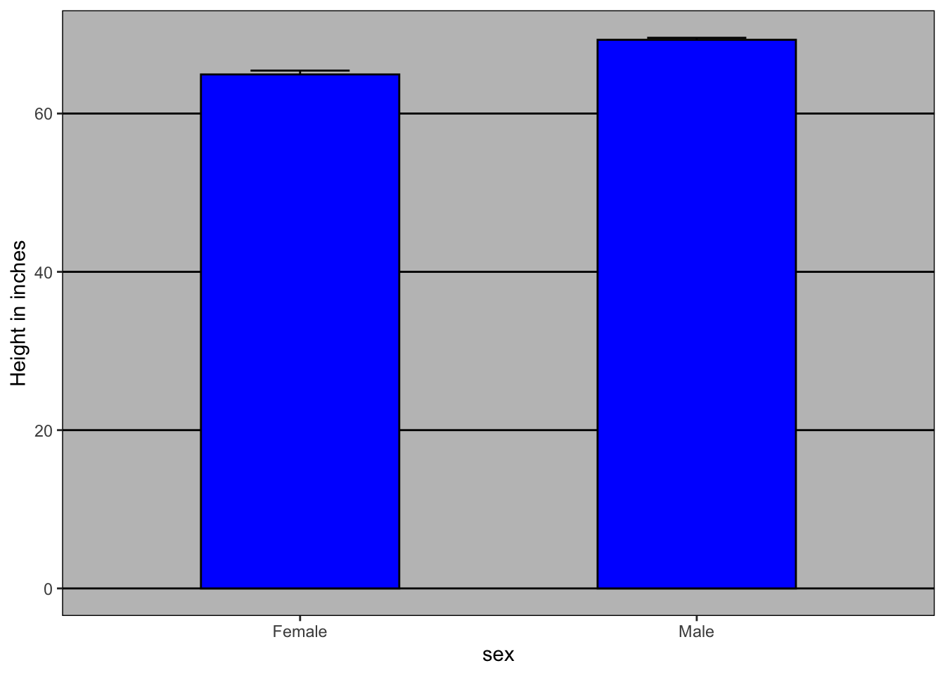
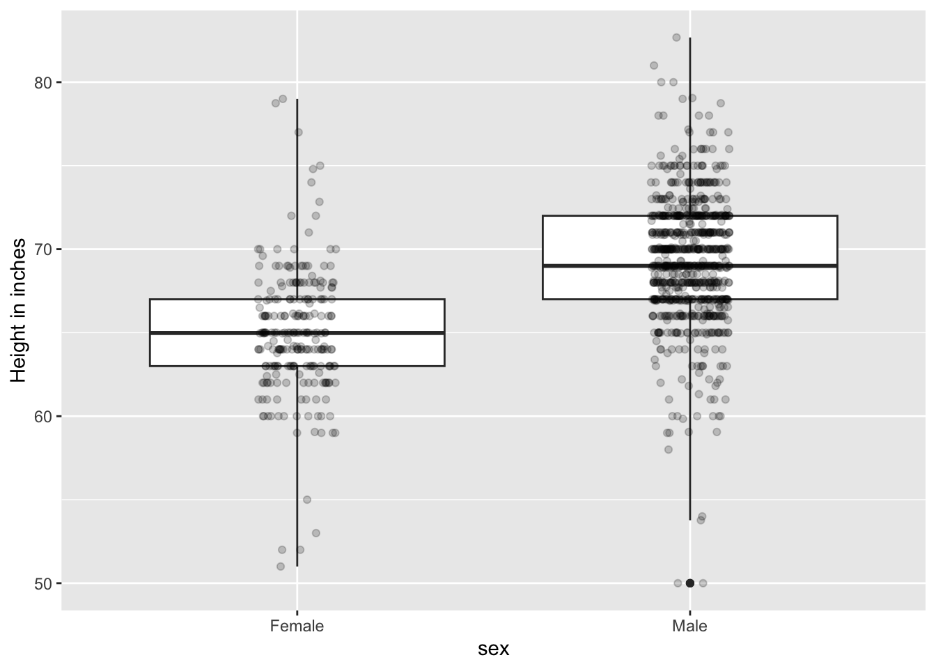
However, this plot can’t answer some of the important questions to understand the different in heights between males and females. For example, the bars go to 0 - does this mean there are tiny humans measuring less than one foot? Are all males taller than the tallest females? Is there a range of heights? By showing all the data points, we can help to answer some of above questions:
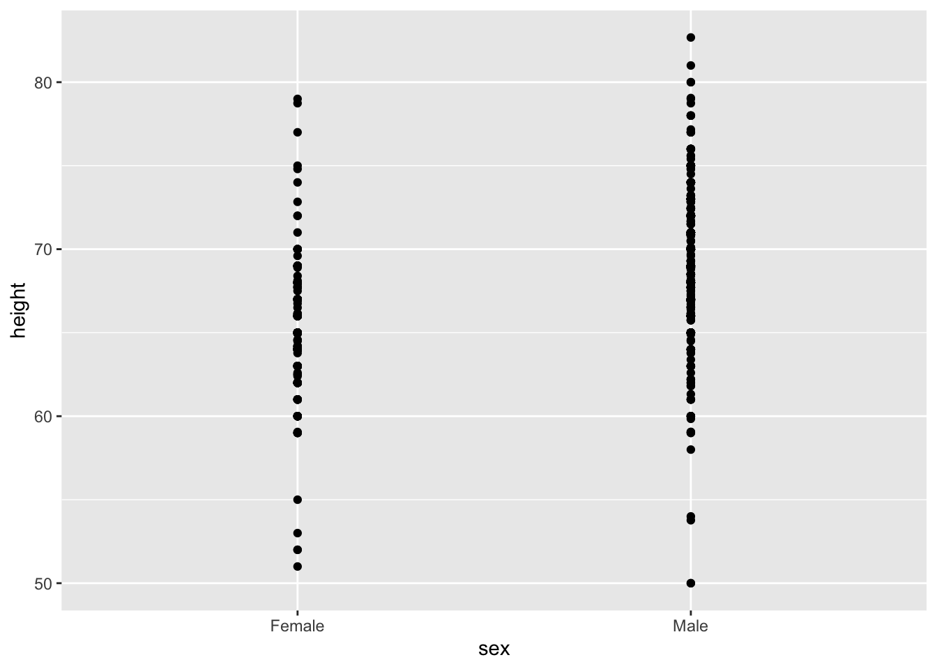
This plot now gives us an idea of the range of the data. However, it is still limited because you can’t really see all the points plotted for females and males - many points are plotted on top of each other. You can improve this visualization in two ways:
- adding a small random shift to each point (called jitter)
- making the points somewhat transparent (called alpha blending)
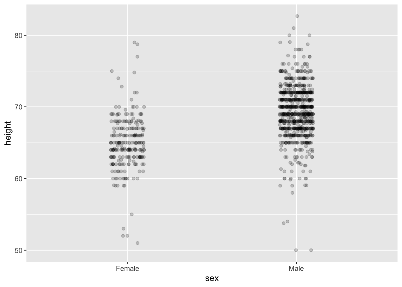
Now we start getting a sense that, on average, males are taller than females. We also note dark horizontal bands of points, demonstrating that many report values that are rounded to the nearest integer.
6. Ease comparisons
6.1. Use common axes
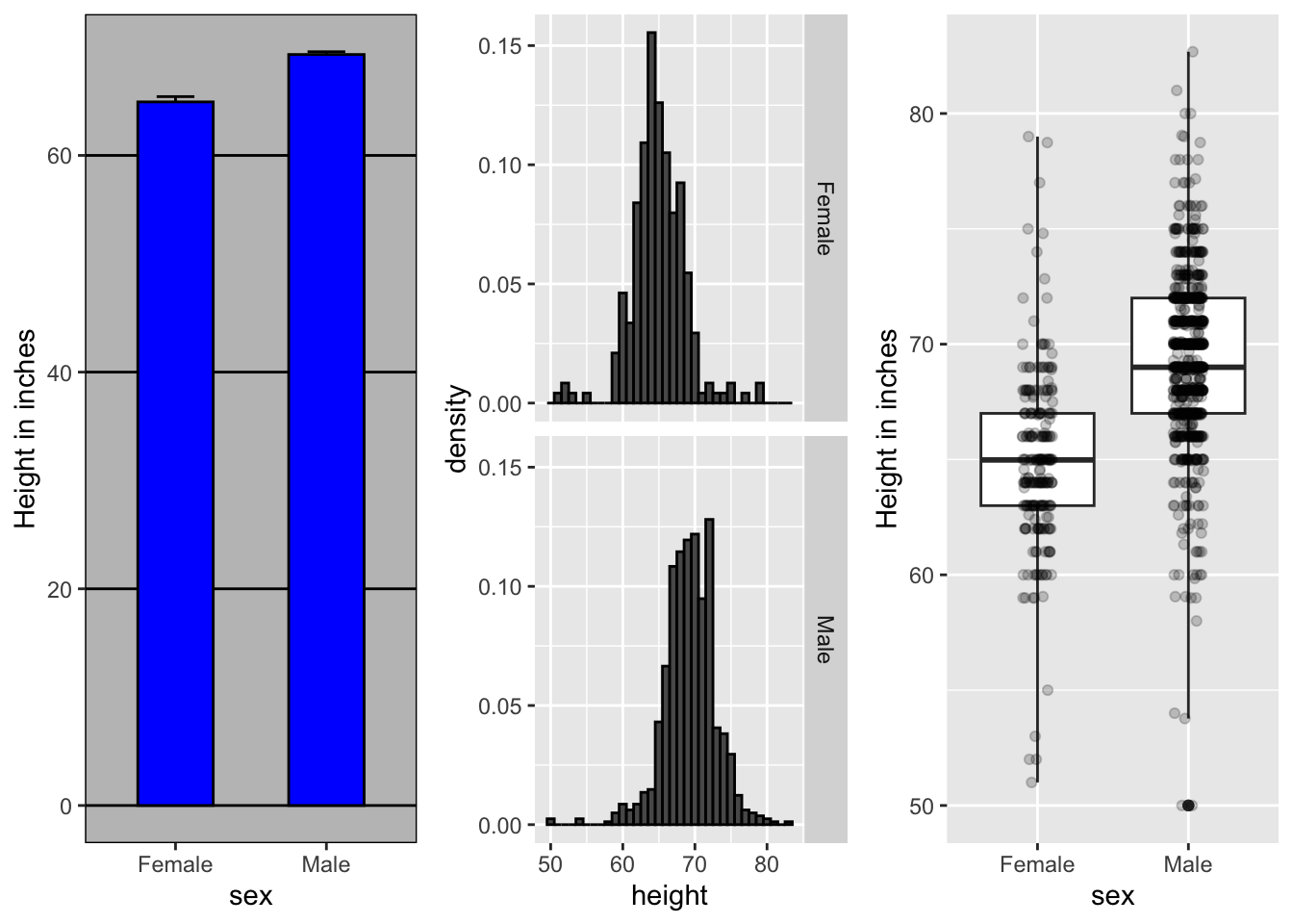
Continue with the height example above - since there are so many points, it is more effective to show distributions rather than individual points. We therefore show histograms for each group:

However, from this plot it is not immediately obvious that males are, on average, taller than females. An important principle here is to keep the axes the same when comparing data across two plots.
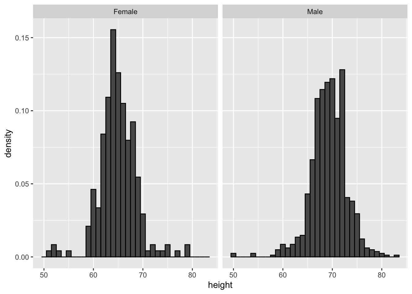
6.2. Aligh plots vertically to see horizontal changes and horizontally to see vertical changes
Aligning the plots vertically helps us see this change when the axes are fixed:
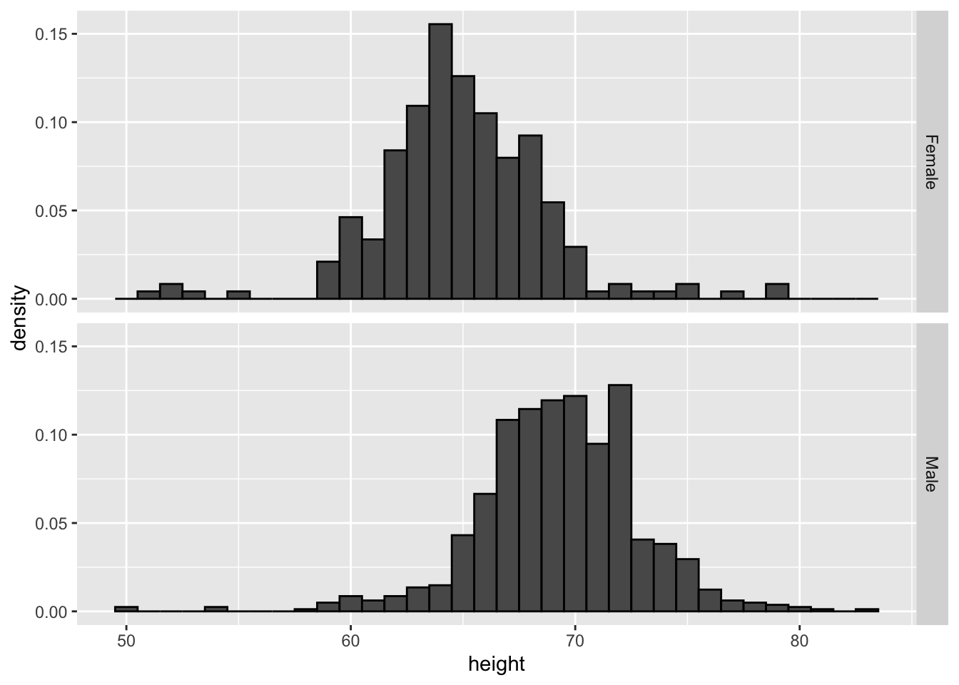
If we want the more compact summary provided by boxplots, we then align them horizontally:
Compare these three plots, using the exactly same data. Barplots are useful for showing one number, but not very useful when we want to describe distributions.
6.3. Consider transformations
The log transformation can be more informative in case where the changes are multiplicative. Population size is an example. As an example, this barplot shows the average population sizes for each continent in 2015:
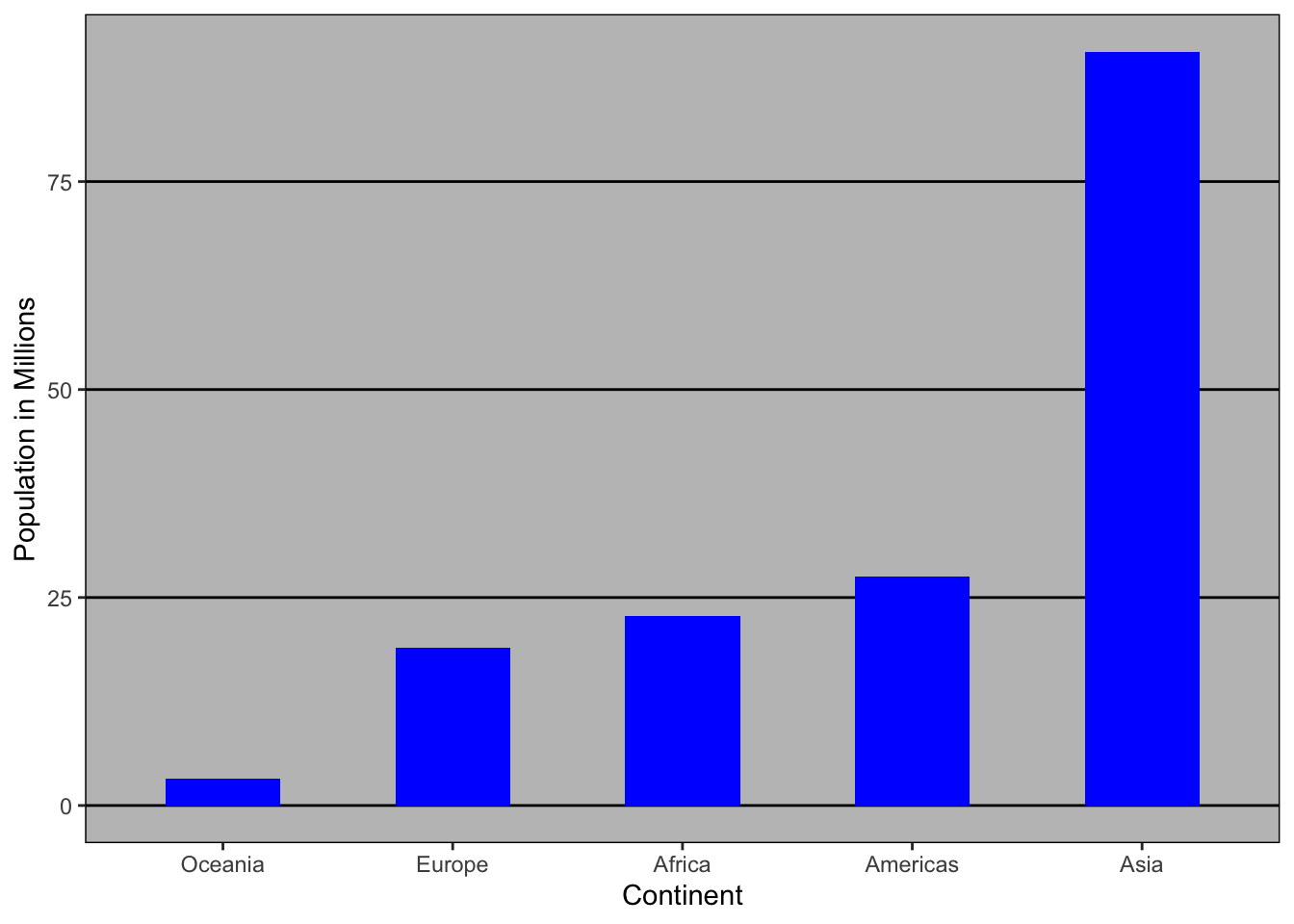
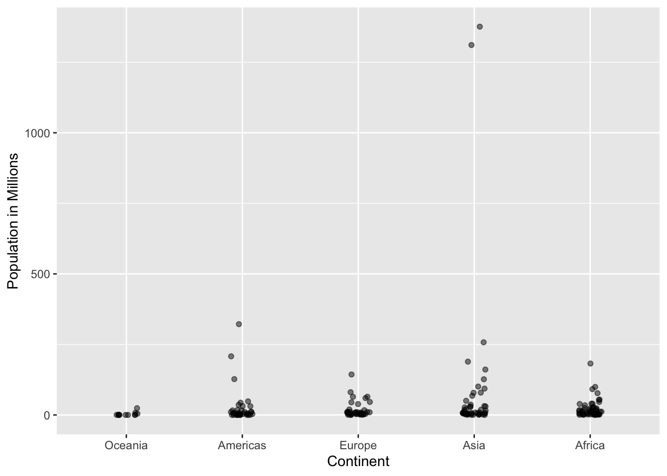
From this plot, one would conclude that countries in Asia are much more populous than in other continents. Following the show the data principle, we quickly notice that this is due to two very large countries, which we assume are India and China:
Using a log transformation here provides a much more informative plot. We compare the original barplot to a boxplot using the log scale transformation for the y-axis:
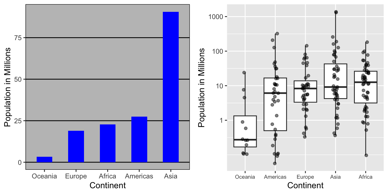
With the new plot, we realize that countries in Africa actually have a larger median population size than those in Asia.
6.4. Visual cues to be compared should be adjacent
For each continent, let’s compare income in 1970 versus 2010. What is the problem in this plot?
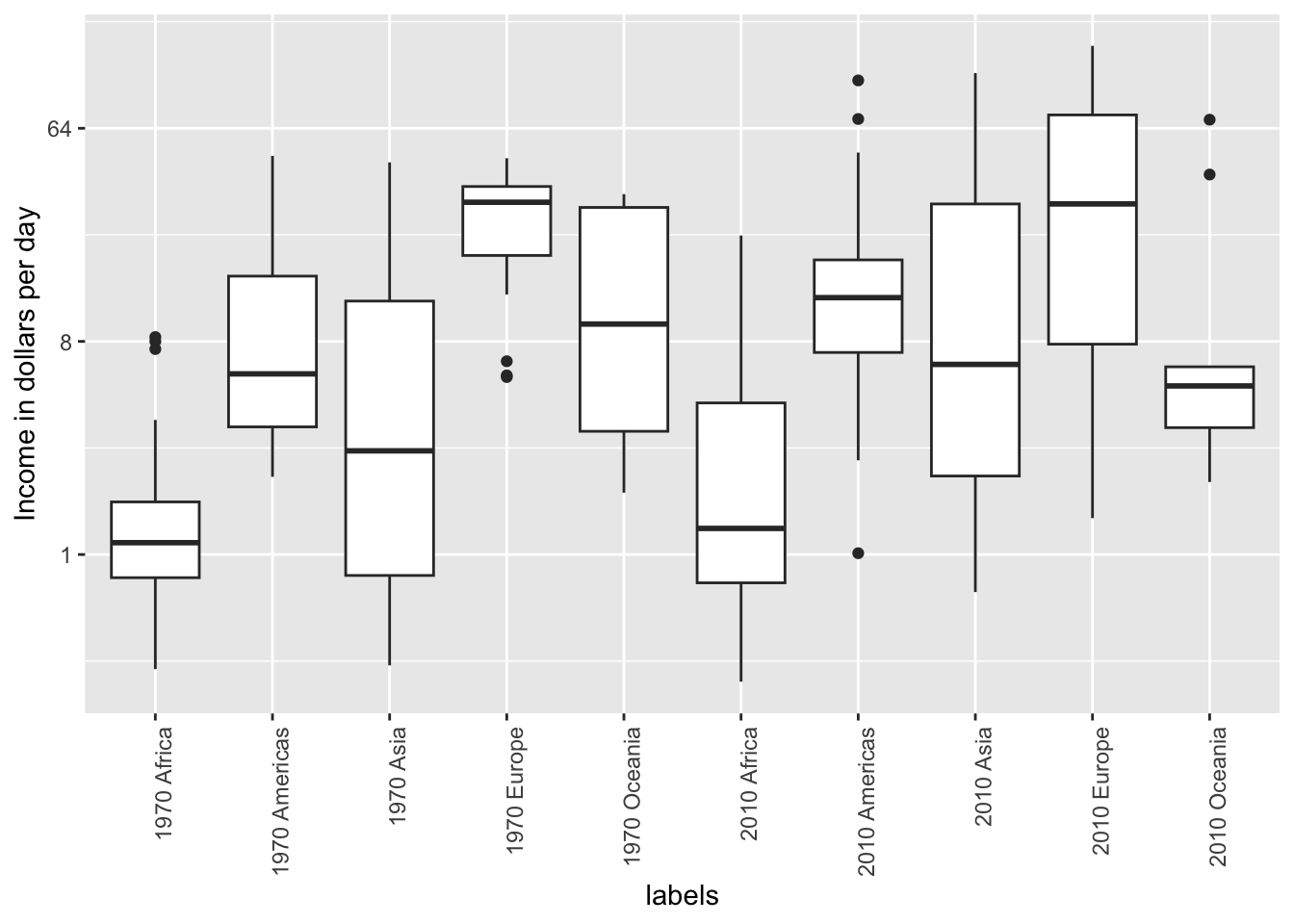
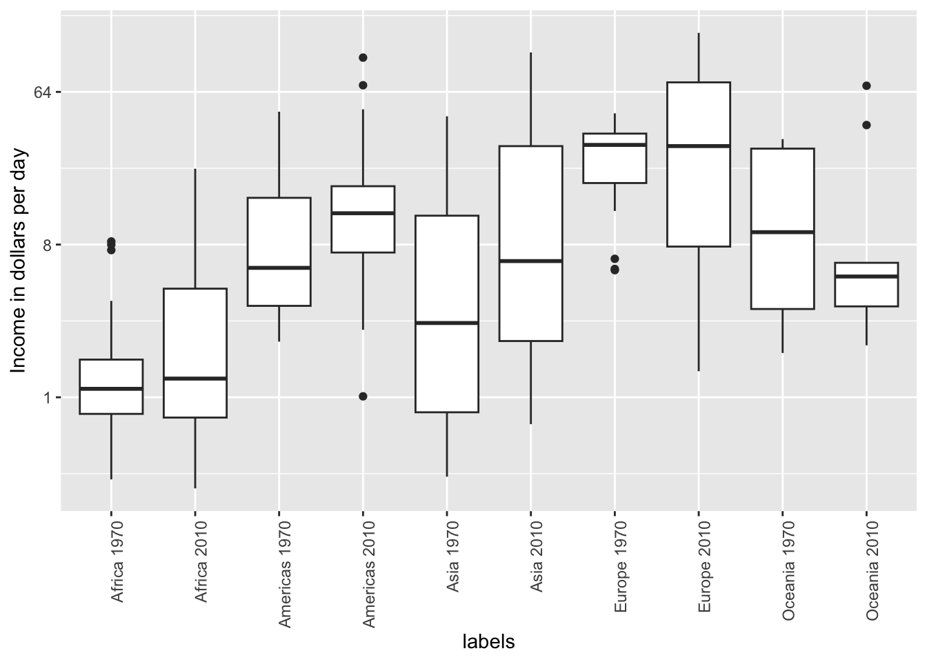
Because x-axis is ordered alphabetically, so all the labels with 1970 come before the labels with 2010 - we want to compare 1970 Africa and 2010 Africa, but they are visually far from each other. It is much easier to make the comparison between 1970 and 2010 for each continent when the boxplots for that continent are next to each other:
6.5. Use color
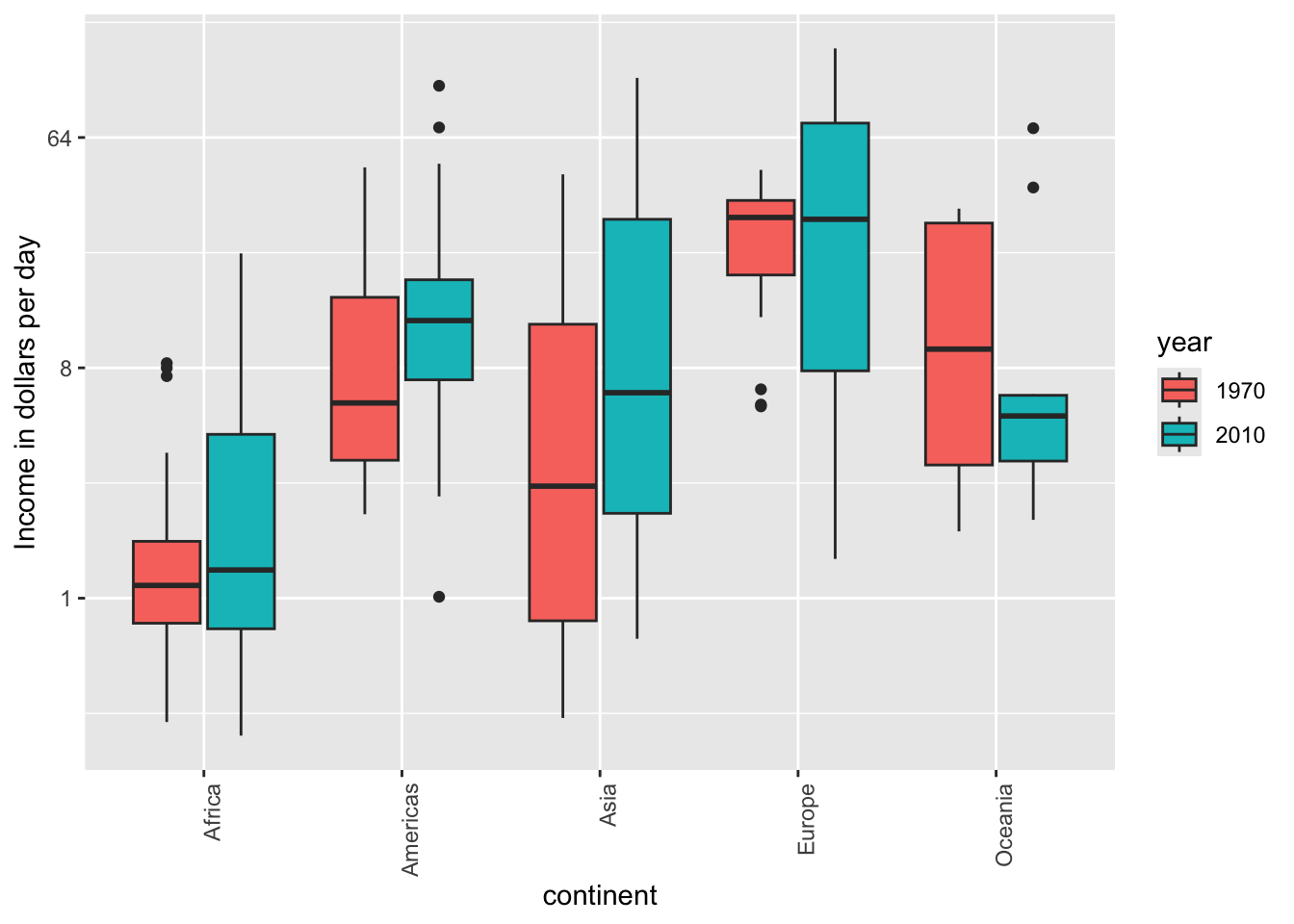
The comparison becomes even easier to make if we use color to denote the two things we want to compare:
7. Think of the color blind
About 10% of the population is color blind. Unfortunately, the default colors used in ggplot2 are not optimal for this group. However, ggplot2 does make it easy to change the color palette used in the plots. An example of how we can use a color blind friendly palette is described here: http://www.cookbook-r.com/Graphs/Colors_(ggplot2)/#a-colorblind-friendly-palette:
color_blind_friendly_cols <-
  c("#999999", "#E69F00", "#56B4E9", "#009E73",
    "#F0E442", "#0072B2", "#D55E00", "#CC79A7")
Here are the colors

There are several resources that can help you select colors, for example this one: http://bconnelly.net/2013/10/creating-colorblind-friendly-figures/.
8. Encoding a third variable
We can encode categorical variables with color and shape. For continuous variables, we can use color, intensity, or size.
When selecting colors to quantify a numeric variable, we choose between two options: sequential and diverging. Sequential colors are suited for data that goes from high to low. Here are some examples offered by the package RColorBrewer:
library(RColorBrewer)
display.brewer.all(type="seq")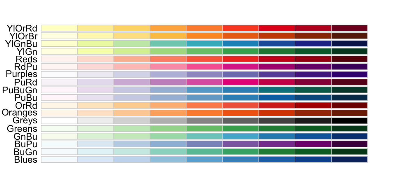
Diverging colors are used to represent values that diverge from a center. We put equal emphasis on both ends of the data range. Here are some examples of divergent patterns:
library(RColorBrewer)
display.brewer.all(type="div")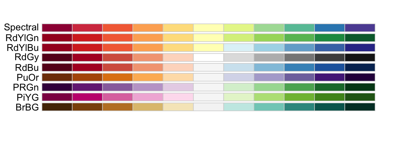
9. Avoid pseudo-three-dimensional plots
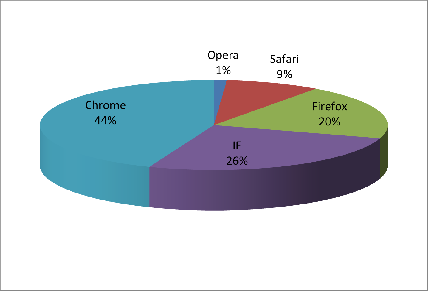
Humans are not good at seeing in three dimensions. Do not use unnecessary (most of the time they are) 3-D plots! Compare these two from the same data:
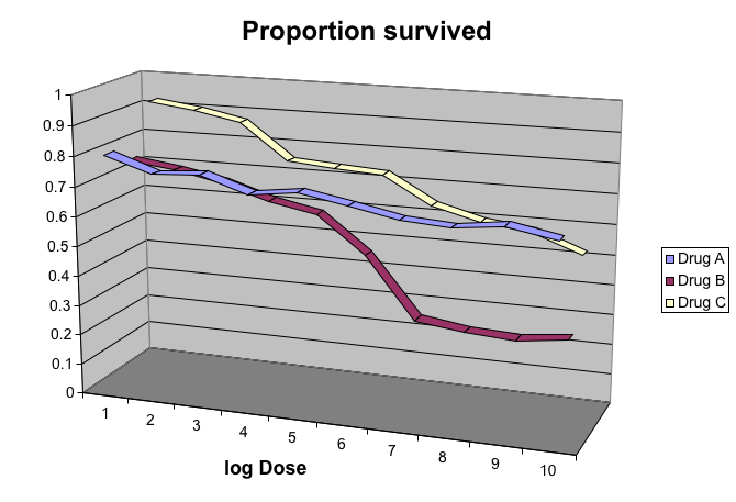
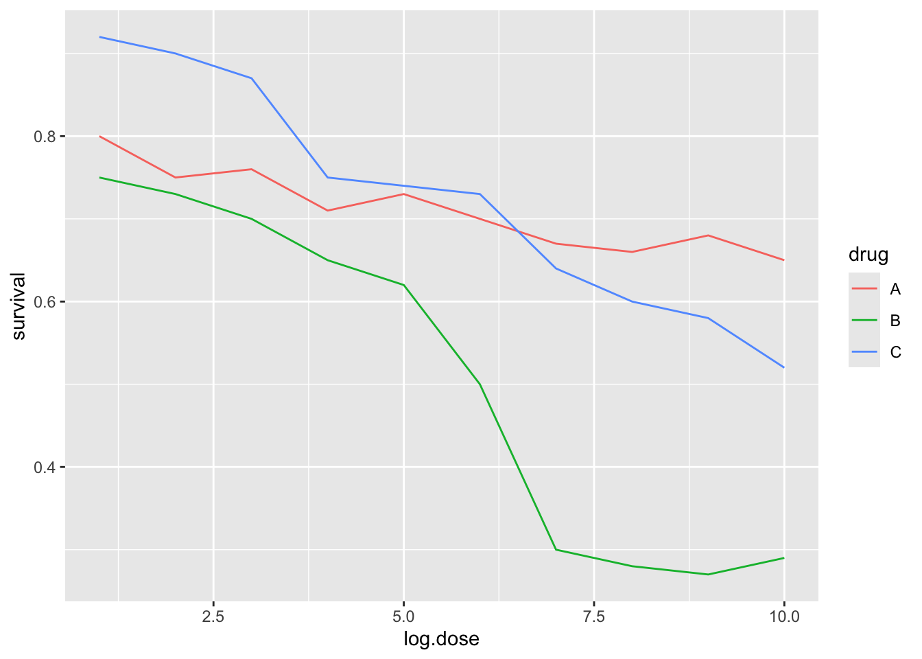
Another terrible example of 3-D plot:
10. Avoid too many significant digits
By default, statistical software like R returns many significant digits. The default behavior in R is to show 7 significant digits. That many digits often adds no information and the added visual clutter can make it hard for the viewer to understand the message.
As an example, this is the disease rates per 10,000 for California across the five decades:
| state | year | Measles | Pertussis | Polio |
|---|---|---|---|---|
| California | 1940 | 37.8826320 | 18.3397861 | 0.8266512 |
| California | 1950 | 13.9124205 | 4.7467350 | 1.9742639 |
| California | 1960 | 14.1386471 | NA | 0.2640419 |
| California | 1970 | 0.9767889 | NA | NA |
| California | 1980 | 0.3743467 | 0.0515466 | NA |
A very small value (0.00001 cases per 10,000) is presented here, but in this example, two significant figures is enough to clearly make the point that rates are decreasing:
| state | year | Measles | Pertussis | Polio |
|---|---|---|---|---|
| California | 1940 | 37.9 | 18.3 | 0.8 |
| California | 1950 | 13.9 | 4.7 | 2.0 |
| California | 1960 | 14.1 | NA | 0.3 |
| California | 1970 | 1.0 | NA | NA |
| California | 1980 | 0.4 | 0.1 | NA |
11. Know your audience
Graphs can be used 1) for your own exploratory data analysis, 2) to convey a message to experts, or 3) to help tell a story to a general audience. Make sure that the intended audience can understand each element of the plot.
References
http://rafalab.dfci.harvard.edu/dsbook-part-1/dataviz/dataviz-principles.html