Session 3_1. Geospatial Visualization and Tables
Geospatial
Geospatial visualizations display data in map form, using colors, shapes, and other visual elements to show the relationship between location and data.
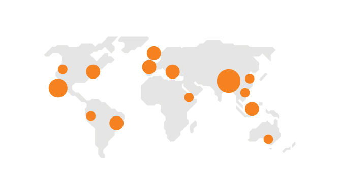
Symbol Maps
Symbols are placed at locations represent events of interest. Measures are represented by shape/size/color to display values.
How to use?
- Avoid overlapping symbols that prevent analysis
- Use the area of the symbol to represent the data
- Do not mix multiple dimensions, because it can cause confusion
- Provide context for scale between big symbols and the small symbols
- You can improve interpretability by properly using size, transparency, color, and layer order.
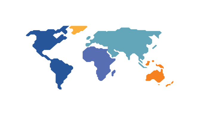
Choropleth, Isopleth, Area Maps
Both choropleths and isopleths are types of area maps, but they have two key differences that separate them: choropleths rely on boundaries, while isopleths rely on continuous data.
When to use?
- Choropleths
- When the geographic precision is important
- You want to show percentages of a whole on a map
- You can divide your data into ranges
- Your data displays a single variable
- Users don’t need to see specific numbers of variables
- Examples: elections, population density, median income, etc.
- Isopleths
- Your data crosses over standard geographical boundaries
- Your data isn’t bound by population
- You don’t need to show the data as a percentage of a whole
- You have continuous data and want to show gradual change and varying density over a geographic region
- Example: estimate wind speed or precipitation
When designing these maps, here are some things to avoid:
- Don’t make the key focus of the map a geographic area that is too small.
- Don’t use conflicting colors or more than one color scheme.
- Don’t try to show more than one category.
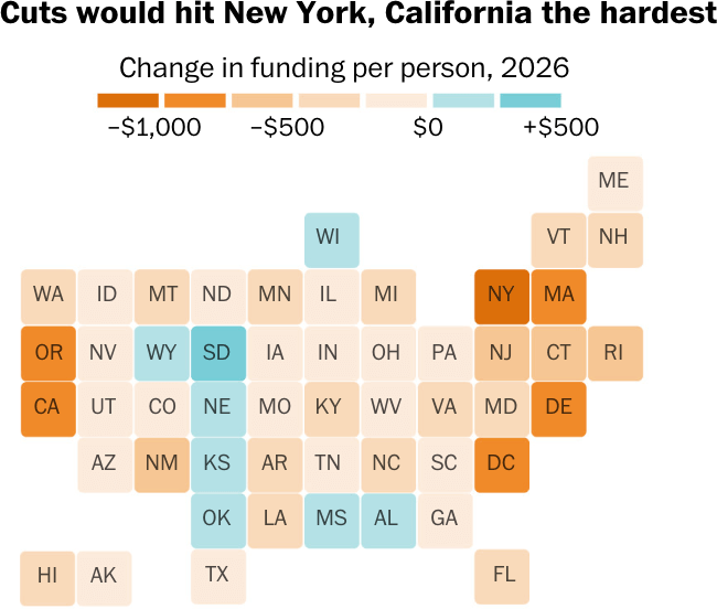
You can include the actual number but often don’t need because colors can represent the hot spots. When quick interpretation of the data is most important, consider using a tile grid map (shape map) to avoid the visual imbalances. These are inherent to choropleth maps due to the varying sizes of geographic areas.
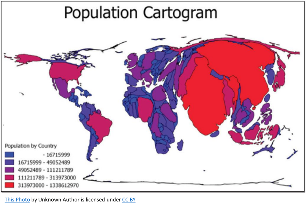
Cartograms: a map in which the geometry of regions is distorted in order to convey the information of an alternative variable. The region are will be inflated or deflated according to its numeric value.
Dot density maps: show density differences in geographic distributions across a landscape. It depicts a quantity for a given area by filling it in with small dots.
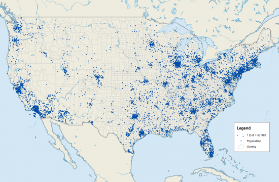
Check this article comparing dot density/distributed vs. symbol maps.
Tables
Tables display data in rows and columns as you’ve likely encountered in a spreadsheet. They represent exact numbers and categories with less focus on being intuitive. While their focus is not inherently visual, visual elements can be layered on to tables to make them more powerful and easier to digest.
Heatmaps
Heatmaps present patterns, trends, and relationships within the data. They provide an intuitive way of representing values using colors, making it easy to identify areas of high and low density.
When to use
- For analysis that needs quick understanding but also still needs specific details
- In conjunction with other chart types, heatmaps can add an extra dimension to your visualization
Not to do
- Too many similar sizes across shapes
- Not a strong enough distinction between big and small numbers
- Unreadable text

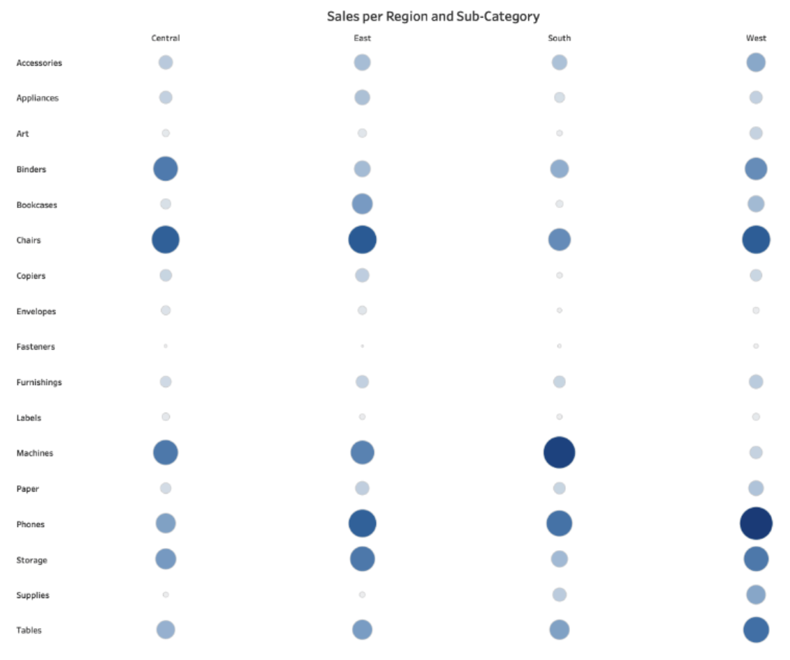
Reference
https://www.tableau.com/data-insights/reference-library/visual-analytics
https://www.datylon.com/resources/chart-library/heatmap